


The Role of Typography in Vape Packaging Design
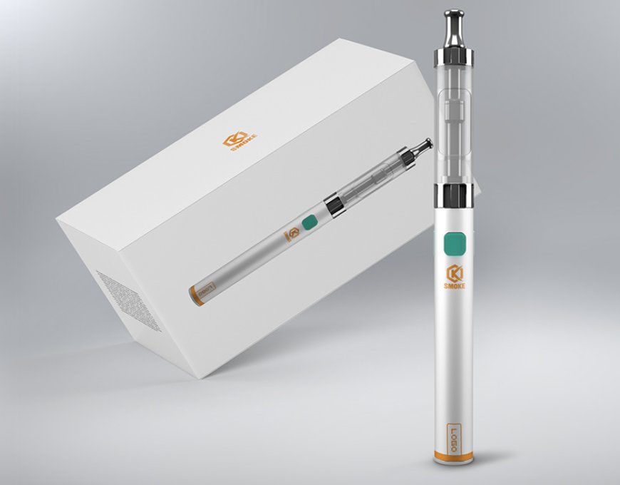
Typography plays a strong role in how products are seen and understood. In vape packaging design, it becomes more than just letters or fonts. It helps deliver brand identity, mood, and trust to the buyers. Good typography can change how people feel when they see a product on the shelf. It is also an important tool to guide buyers’ attention and influence their choices. Let's explore how typography works in different areas of vape packaging.
Communicating Brand Identity with Typography
Typography tells the customer what kind of brand they are dealing with. A modern, clean font might show a sleek and tech-forward brand. A bold, handwritten style may feel more youthful or rebellious. The shape, size, and style of letters all send subtle messages.
For vape products, the font needs to match the product image. A luxury vape brand might use thin serif fonts with gold accents. A fun, fruity flavor might use round, soft fonts with bright colors. This first look helps buyers connect to the product emotionally. When the font reflects the brand’s message, it builds trust. Customers often feel more confident buying when they can "read" the brand's tone from the packaging.
Typography is also useful for making a product stand out. In a crowded market, unique lettering draws the eye. Choosing the right typeface helps products get noticed. This is very helpful in physical stores where buyers scan shelves quickly.
The right typography also shows that the brand is serious. Bad font choices make a product look cheap or poorly made. Careful design choices show that effort and planning went into the packaging. This adds to the overall appeal and trust.
Enhancing Readability and Legibility
Typography must always be readable. No matter how stylish a font looks, if people can’t read the label quickly, they may not buy the product. Readability means how easy it is to read long texts. Legibility means how clear each letter is. Both matter on vape packaging. Customers want to find the name, flavor, and details of a vape product fast.
Tiny or messy fonts can frustrate them. If the important information is hard to find, they might skip that product. That’s why spacing, font size, and layout are important. Clear letters, good contrast, and neat design all help buyers read with ease.
Text should not blend into the background. Fonts should be large enough to read even from a distance. Letter spacing also matters. Letters that are too close or too far apart make words harder to understand. Good design balances all these parts for better legibility.
Different font types affect readability in different ways. Serif fonts (those with little feet) are good for printed text. Sans-serif fonts (simple, clean styles) work well on packaging because they’re easy to read. The goal is to avoid confusion and allow the buyer to take in the message quickly.
Evoking Emotions Through Letterforms
Typography can stir emotions. The shape and style of letters influence how people feel about a product. For vape packaging, emotional impact is important because the product itself is often tied to lifestyle or mood.
Rounded fonts feel soft, friendly, and fun. Sharp, angled fonts look edgy or bold. Vintage typefaces suggest tradition and trust. A script font may feel romantic or personal. All these feelings start forming before a customer even reads the words.
Colors and textures add to the emotion. A black and white font feels more serious. A handwritten style in soft pink might feel playful or relaxing. The packaging must speak to the buyer’s feelings, and typography is the voice.
Emotions also help shape the story. If a vape flavor is cool and minty, the font might be icy blue and sleek. If it’s a warm vanilla, the letters might feel soft and cozy. Each font style should match the product's message. This builds emotional trust and encourages connection.
Building Trust and Safety Through Typography
Typography also plays a big role in building trust. Vape products need to show they are safe, regulated, and high-quality. Fonts and layout choices can support this feeling of trust.
A clean and professional font style sends a message of responsibility. Safety information like ingredients, age warnings, or usage tips should be easy to find and read. If this data is hidden or unclear, it may cause doubt.
Using space well and not overloading the label with words can help. A neat, well-planned design feels more trustworthy. Fonts that look stable and balanced help reinforce this.
It’s also helpful to use consistent styles across product lines. This makes brands easier to recognize. If every product uses the same font style and layout, buyers feel familiar and secure.
Typography also supports compliance. Certain warnings or legal info may be required by law. Fonts must make this info readable without ruining the look of the packaging. Smart design can meet these needs while still being attractive.
Creating Visual Hierarchy and Flow
Good typography guides the viewer’s eye. A strong visual flow helps people take in the message quickly. This is known as hierarchy. It helps separate important info from supporting details.
Font weight, size, and style can highlight key details. For example, the product name may be bold and large. The flavor name might be in a different color or script. Smaller text gives details like volume or ingredients.
Headings, subheadings, and body text need contrast. If everything looks the same, the reader may feel lost. Structure gives them a path to follow. Typography helps create that structure in a subtle way.
Spacing also adds to flow. Space between lines (leading) and between letters (tracking) keeps text from feeling crowded. A clear layout invites people to explore more of the packaging.
Hierarchy improves experience and decision-making. When buyers find the info they want fast, they feel more confident. They are more likely to trust and buy the product.
Reflecting Flavor and Experience
Typography can reflect the taste and feeling of the product. This is especially useful for vape packaging, where flavor is one of the biggest selling points.
Each flavor has its own mood. A citrus flavor might feel sharp and bright. A dessert flavor might feel sweet and smooth. Fonts can help express this feeling through curves, weights, and colors.
Here are a few ways fonts reflect flavor:
- Bold block letters suggest strong or spicy flavors.
- Soft script fonts match creamy or dessert-like tastes.
- Minimal, clean fonts pair well with mint or cooling sensations.
This helps customers imagine the taste just by looking at the label. The more sensory connection they feel, the more likely they are to try the product. Packaging that matches the flavor experience through design is more memorable.
Typography Trends in Modern Packaging
Design trends in typography change over time. Staying updated helps brands stay relevant. For vape packaging, modern styles can catch the eye and feel fresh.
Minimalism is a common trend. Simple, clean fonts with lots of space feel modern and smart. These styles often use sans-serif fonts and limited colors.
Retro styles are also popular. They bring a sense of nostalgia. Brands use bold vintage fonts to connect with certain age groups. This can work well if the flavor or brand story matches the old-school look.
Bold typography is another trend. Some brands use giant fonts to cover most of the label. This demands attention and makes the product easy to recognize.
Handwritten or custom fonts are also rising. These create a personal feel. They suggest creativity and uniqueness.
Conclusion
Typography is more than just a design element—it is a powerful tool that shapes how people see and feel about a product. In vape packaging, it plays a vital role in telling the brand’s story, attracting attention, and making key information easy to understand. The right use of fonts can reflect flavor, show trust, guide the buyer’s eye, and stay within legal rules. When done well, typography adds value and emotion to the product. It connects with the customer before they even pick it up. By focusing on clear, creative, and thoughtful type choices, brands can make their packaging more appealing and effective.