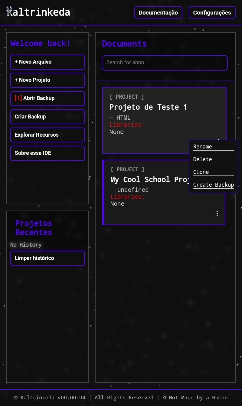


Kaltrinkeda — Home Screen V2
This is the brand-new experimental design of Kaltrinkeda's Home Screen. Our IDE stands out because its design is 100% based on Blur. It doesn’t have a light theme, but I plan to make the colors customizable. Our IDE has something unique: an animated background on the home screen. This design evokes dust, with particles floating across the screen, all without crashing your device. The animation is very well optimized because nothing is pre-defined. The dust particles move randomly across the screen using mathematical calculations. In other words, a 5-line script will randomly select numbers from 1 to 50 and move them to a random location. Moreover, the particles are not rendered in HD. They are just groups of pixels. Although they may appear as spheres, they are, on average, 1 to 10 pixels grouped with a blur effect applied to them, making them appear round. The blur of the particles is calculated simultaneously for all of them, rather than each particle having an independent blur. It’s one single effect applied to all at once. The particles not only move, but they also blink, and that’s a detail. The Home Screen has 3 main containers: Welcome Back: This is where you’ll find buttons to create a project, access files, manage backups, explore new functions, provide project support, and handle general user interaction. These buttons are essential. Recent Projects: A history of what you’ve done in the app. The plan is for this history to save your progress, allowing you to access older versions of your code. So, if the code worked, but something broke after you made a change, you could go back to the version that worked, compare them, and figure out what went wrong. The idea is for this to happen natively, with the app highlighting all changes and even possible errors and issues. Documents: This section contains your documents, files, projects, text files, notes, and more. What’s innovative here is the styling: each file has a different color based on its language, and the embed changes color accordingly. Python files are blue, JavaScript files are yellow, projects have no color, Java is red, Ruby is orange, and so on. The Documents tab not only shows the file, but it also displays its size, name, language, what it is, and the libraries used by that file/project. In the future, it will be possible to download the files, create backups, and much more. There are no updates on the app’s settings yet, because I want you to be surprised, so I’ll save that for a future post. But I can say that customization will be available, as long as it doesn’t make the app heavy. The goal of NMBAH is the opposite, to provide you with a lightweight, optimized, and functional app. You’ll even be able to disable the background in case your device is lagging, and our optimization fails. Sometimes, people have old devices, and that’s all they can afford for now. If it makes the app heavy, we can’t implement it. The focus here is not customization but functionality. The priority is that the app works, has no bugs, and is well optimized. Also, yes, our blur is optimized. We use something called Blur Onion, which is basically layers. The user sees the blur, but beneath it, there’s a pixelated mosaic layer. This forces the blur to process a pixelated image, reducing the amount of processing required, making it load faster, and needing fewer calculations since the pixel count is lower, making the processing faster and more efficient. NMBAH doesn’t invest in profit; we invest in an unforgettable experience. And that’s what our app should do. The user should enter, even without ever having seen the app before, and be able to use it without any difficulty. A simple, intuitive interface. We give you for free what famous IDEs charge for. And we give you much more than they do, for free, including what they offer, plus many additional features.

This is the brand-new experimental design of Kaltrinkeda's Home Screen. Our IDE stands out because its design is 100% based on Blur. It doesn’t have a light theme, but I plan to make the colors customizable.
Our IDE has something unique: an animated background on the home screen. This design evokes dust, with particles floating across the screen, all without crashing your device.
The animation is very well optimized because nothing is pre-defined. The dust particles move randomly across the screen using mathematical calculations. In other words, a 5-line script will randomly select numbers from 1 to 50 and move them to a random location.
Moreover, the particles are not rendered in HD. They are just groups of pixels. Although they may appear as spheres, they are, on average, 1 to 10 pixels grouped with a blur effect applied to them, making them appear round. The blur of the particles is calculated simultaneously for all of them, rather than each particle having an independent blur. It’s one single effect applied to all at once.
The particles not only move, but they also blink, and that’s a detail.
The Home Screen has 3 main containers:
Welcome Back: This is where you’ll find buttons to create a project, access files, manage backups, explore new functions, provide project support, and handle general user interaction. These buttons are essential.
Recent Projects: A history of what you’ve done in the app. The plan is for this history to save your progress, allowing you to access older versions of your code. So, if the code worked, but something broke after you made a change, you could go back to the version that worked, compare them, and figure out what went wrong. The idea is for this to happen natively, with the app highlighting all changes and even possible errors and issues.
Documents: This section contains your documents, files, projects, text files, notes, and more. What’s innovative here is the styling: each file has a different color based on its language, and the embed changes color accordingly. Python files are blue, JavaScript files are yellow, projects have no color, Java is red, Ruby is orange, and so on.
The Documents tab not only shows the file, but it also displays its size, name, language, what it is, and the libraries used by that file/project. In the future, it will be possible to download the files, create backups, and much more.
There are no updates on the app’s settings yet, because I want you to be surprised, so I’ll save that for a future post. But I can say that customization will be available, as long as it doesn’t make the app heavy. The goal of NMBAH is the opposite, to provide you with a lightweight, optimized, and functional app.
You’ll even be able to disable the background in case your device is lagging, and our optimization fails. Sometimes, people have old devices, and that’s all they can afford for now. If it makes the app heavy, we can’t implement it.
The focus here is not customization but functionality. The priority is that the app works, has no bugs, and is well optimized.
Also, yes, our blur is optimized.
We use something called Blur Onion, which is basically layers. The user sees the blur, but beneath it, there’s a pixelated mosaic layer. This forces the blur to process a pixelated image, reducing the amount of processing required, making it load faster, and needing fewer calculations since the pixel count is lower, making the processing faster and more efficient.
NMBAH doesn’t invest in profit; we invest in an unforgettable experience.
And that’s what our app should do. The user should enter, even without ever having seen the app before, and be able to use it without any difficulty. A simple, intuitive interface.
We give you for free what famous IDEs charge for.
And we give you much more than they do, for free, including what they offer, plus many additional features.