


Integrating Localization Into Design Systems
Learn how two designers tackled the challenges of building a localization-ready design system for a global audience. This case study dives into how Rebecca and Mark combined Figma Variables and design tokens to address multilingual design issues, such as text overflow, RTL layouts, and font inconsistencies.
Mark and I work as product designers for SAS, a leader in analytics and artificial intelligence recognized globally for turning data into valuable insights. Our primary role is to support the token packages and component libraries for the SAS Filament Design System. SAS’ customer base is global, meaning people from diverse countries, cultures, and languages interact with products built with the Filament Design System.
SAS designers use Figma libraries developed by the Filament Design System team to create UX specifications. These high-fidelity designs are typically crafted in English, unknowingly overlooking multilingual principles, which can result in layout issues, text overflow, and challenges with right-to-left (RTL) languages. These issues cascade into the application, ultimately creating usability issues for SAS customers. This highlights the need to prioritize localization from the start of the design process.
With the introduction of Figma Variables, alongside the advancements in design tokens, we saw an opportunity for designers. We imagined a system where a Figma design could dynamically switch between themes, densities, and even languages.
This would allow us to design and test multilingual capabilities more effectively, ensuring our design system was both flexible and adaptable.
While researching localization integration for design systems, we realized a significant gap in existing documentation on supporting localization and internationalization in design tokens and Figma Variables. Many of the challenges we faced, such as managing typography across locales or adapting layouts dynamically, were undocumented or only partially addressed in available resources.
Our story demonstrates how combining foundational principles of multilingual design with design tokens can help tackle the complexities of language switching in design systems. We are not arguing that our approach is the best, but given the lack of documentation available on the subject, we hope it will get the conversation started.
But before we start, it’s essential to understand the distinction between Localization (L10n) and Internationalization (I18n).
Localization (L10n) refers to the process of adapting designs for specific languages, regions, or cultures and involves the following:
- Translating text;
- Adjusting layouts to accommodate language-specific requirements, such as longer or shorter text strings or right-to-left (RTL) text for languages like Arabic;
- Ensuring visual elements are culturally appropriate and resonate with the target audience.
Internationalization (I18n) is the preparation phase, ensuring designs are flexible and adaptable to different languages and regions. Key considerations in Figma include:
- Using placeholder text to represent dynamic content;
- Setting up constraints for dynamic resizing to handle text expansion or contraction;
- Supporting bi-directional text for languages that require RTL layouts.
These concepts are not only foundational to multilingual design but also integral to delivering inclusive and accessible experiences to global users. Pre-Figma Setup: Building A Framework
Understanding Our Design Token System
Before diving deeper, it’s crucial to understand that our design tokens are stored in JSON files. These JSON files are managed in an application we call “Token Depot,” hosted on our corporate GitHub.
We utilize the Tokens Studio plugin (pro plan) to transform these JSON files into Figma libraries. For us, design tokens are synonymous with variables — we don’t create additional variables that only exist in Figma. However, we do create styles in Figma that serve as “recipe cards” for specific HTML elements. For instance, an H2 might include a combination of font-family, font-size, and font-weight.
It’s important to note that our design token values are directly tied to CSS-based values.
Initial Setup: Theme Switching And Localization
In 2022, we took on the massive task of refactoring all our token names to be more semantic. At that time, we were only concerned with theme switching in our products.
Our tokens were re-categorized into the following groups:
- Color
- Brand colors (SAS brand colors)
- Base colors (references to Brand colors)
- Typography (e.g., fonts, spacing, styles)
- Space (e.g., padding, margins)
- Size (e.g., icons, borders)
- Style (e.g., focus styles)
- Motion (e.g., animations)
- Shadow.

In our early setup:
- A core folder contained JSON files for values unaffected by theme or brand.
- Brand folders included three JSON files (one for each theme). These were considered “English” by default.
- A separate languages folder contained overrides for other locales, stacked on top of brand files to replace specific token values.
Our JSON files were configured with English as the default. Other locales were managed with a set of JSON files that included overrides for English. These overrides were minimal, focusing mainly on font and typography adjustments. For example, bold typefaces often create issues because many languages like Chinese, Japanese, or Korean (CJK languages) fonts lack distinct bold versions. Thus, we replaced the font-weight token value from 700 to 400 in our CJK locales.
We also update the values for font-family, letter spacing, font-style, and font-variant tokens. In Figma, our application screens were originally designed in English, and in 2023, we only implemented theme-switching modes, not language options. Additionally, we created detailed lists to document which design tokens could be converted to Figma variables and which could not, as the initial release of variables supported only a limited set.
Introducing Density Switching
The introduction of density switching in our products marked a significant turning point. This change allowed us to revisit and improve how we handled localization and token management. The first thing we had to figure out was the necessary token sorting. We ended up with the following list:
Tokens Impact By Theme And Density
Unaffected by Theme or Density:
- Color
- Brand colors
- Base colors
- Motion
- Shadow
- Size
- Border size
- Outline size
- Typography
- Base font size
- Letter spacing and word spacing
- Overflow, text, and word style tokens.
Tokens Impacted by Density:
- Typography
- Font sizes
- Line Height
- Font spacing
- Size
- Border radius
- Icon sizes
- Space
- Base spacing.
Tokens Impacted by Theme:
- Colors
- Action, body, container, dataviz, display, heading, highlight, icon, label, status, syntax, tag, text, thumbnail, and zero-stat
- Size
- Border size
- Typography
- Font-family
- Style
- Action (focus styles).
With density, we expanded locale-specific value changes beyond font-family, letter spacing, font-style, and font-variant tokens to additionally include:
- Font sizes
- Icon sizes
- Line height
- Spacing
- Border radius.
Revisiting our type scale and performing numerous calculations, we documented the required token value changes for all the locales across the density. This groundwork enabled us to tackle the restructuring of our JSON files effectively.

JSON File Restructuring
In our token repository, we:
- Updated the tokens in the core folder.
- Added a density folder and a language folder in each brand.
After collaborating with our front-end development team, we decided to minimize the number of JSON files. Too many files introduce complexity and bugs and hinder performance. Instead of creating a JSON file for each language-density combination, we defined the following language categories:
Language Categories
- Western European and Slavic Languages
- Polish, English, French, German, and Spanish
- Chinese Languages
- Simplified and traditional scripts
- Middle Eastern and East Asian Languages
- Arabic, Hebrew, Japanese, Korean, Thai, and Vietnamese
- Global Diverse
- Africa, South Asia, Pacific, and Indigenous languages, Uralic, and Turkic groups.
These categories became our JSON files, with one file per density level. Each file contained tokens for font size, icon size, line height, spacing, and border-radius values. For example, all Chinese locales shared consistent values regardless of font-family.

In addition, we added a folder containing JSON files per locale, overriding core values and theme folders, such as font-family. Figma Setup: Bridging Tokens And Design
Token Studio Challenges
After restructuring our JSON files, we anticipated gaining support for typography variables in the Tokens Studio plugin. Instead, Tokens Studio released version 2.0, introducing a major shift in workflow. Previously, we imported JSON files directly into Figma and avoided pushing changes back through the plugin. Adjusting to the new version required us to relearn how to use the plugin effectively.
Our first challenge was navigating the complexity of the import process. The $metadata.json and $themes.json files failed to overwrite correctly during imports, resulting in duplicate collections in Figma when exporting variables. Despite recreating the required theme structure within the plugin, the issue persisted. To resolve this, we deleted the existing $metadata.json and $themes.json files from the repository before pulling the updated GitHub repo into the plugin. However, even with this solution, we had to manually remove redundant collections that appeared during the export process.
Once we successfully migrated our tokens from JSON files into Figma using the Tokens Studio plugin, we encountered our next challenge.
Initially, we used only “English” and theme modes in Figma, relying primarily on styles since Figma’s early variable releases lacked support for typography variables. Now, with the goal of implementing theme, density, and language switching, we needed to leverage variables — including typography variables. While the token migration successfully brought in the token names as variable names and the necessary modes, some values were missing.
Typography variables, though promising in concept, were underwhelming in practice. For example, Figma’s default line-height multiplier for “auto” was 1.2, below the WCAG minimum of 1.5. Additionally, our token values used line-height multipliers, which weren’t valid as Figma variable values. While a percentage-based line-height value is valid in CSS, Figma variables don’t support percentages.
Our solution involved manually calculating pixel values for line heights across all typography sizes, locale categories, and densities. These values were entered as local variables in Figma, independent of the design token system. This allowed us to implement correct line-height changes for density and locale switches. The process, however, was labor-intensive, requiring the manual creation of hundreds of local variables. Furthermore, grouping font sizes and line heights into Figma styles required additional manual effort due to the lack of support for line-height multipliers or percentage-based variables.
Examples:
- For CJK locales, medium and low density use a base font size of 16px, while high density uses 18px.
- Western European and Slavic languages use 14px for medium density, 16px for high, and 12px for low density.
Additional Challenges
- Figma vs. Web Rendering
In Figma, line height centers text visually within the text box. In CSS, it affects spacing differently depending on the box model. This mismatch required manual adjustments, especially in light of upcoming CSS properties likeleading-trim. - Letter-Spacing Issues
While CSS defaults to “normal” for letter-spacing, Figma requires numeric values. Locale-specific resets to “normal” couldn’t utilize variables, complicating implementation. - Font-Family Stacks
- Example stack for Chinese:
font-family-primary: 'AnovaUI','微软雅黑体','Microsoft YaHei New','微软雅黑','Microsoft Yahei','宋体','SimSun','Helvetica Neue','Helvetica','Arial',sans-serif.
- Example stack for Chinese:
Starting with a Western font ensured proper rendering of Latin characters and symbols while maintaining brand consistency. However, Figma’s designs using only AnovaUI (SAS Brand Custom font) couldn’t preview locale-based substitutions via system fonts, complicating evaluations of mixed-content designs.
Finally, as we prepared to publish our new library, we encountered yet another challenge: Figma Ghosts.
What Are Figma Ghost Variables?
Figma “ghost variables” refer to variables that remain in a Figma project even after they are no longer linked to any design tokens, themes, or components.
These variables often arise due to incomplete deletions, improper imports, or outdated metadata files. Ghost variables may appear in Figma’s variable management panel but are effectively “orphaned,” as they are disconnected from any meaningful use or reference.

Why They Cause Issues for Designers:
- Clutter and Confusion
Ghost variables make the variable list longer and harder to navigate. Designers might struggle to identify which variables are actively in use and which are obsolete. - Redundant Work
Designers might accidentally try to use these variables, leading to inefficiencies or design inconsistencies when the ghost variables don’t function as expected. - Export and Sync Problems
When exporting or syncing variables with a design system or repository, ghost variables can introduce errors, duplicates, or conflicts. This complicates maintaining alignment between the design system and Figma. - Increased Maintenance Overhead
Detecting and manually deleting ghost variables can be time-consuming, particularly in large-scale projects with extensive variable sets. - Thematic Inconsistencies
Ghost variables can create inconsistencies across themes, as they might reference outdated or irrelevant styles, making it harder to ensure a unified look and feel.
Addressing ghost variables requires careful management of design tokens and variables, often involving clean-up processes to ensure only relevant variables remain in the system.
Cleaning Up Ghost Variables
To avoid the issues in our Figma libraries, we first had to isolate ghost variables component by component. By selecting a symbol in Figma and navigating the applied variable modes, we had a good sense of which older versions of variables the symbol was still connected to. We found disconnected variables in the component library and our icon library, which resulted in compounded ghost variables across the system. We found that by traversing the layer panel, along with a fantastic plug-in called “Swap Variables,” we were able to remap all the ghost variables in our symbols.
If we had not completed the clean-up step, designers would not be able to access the overrides for theme, density, and locale.
Designing Symbols For Localization
To ensure Figma symbols support language swapping, we linked all text layers to our new variables, including font-family, font-size, and line height.
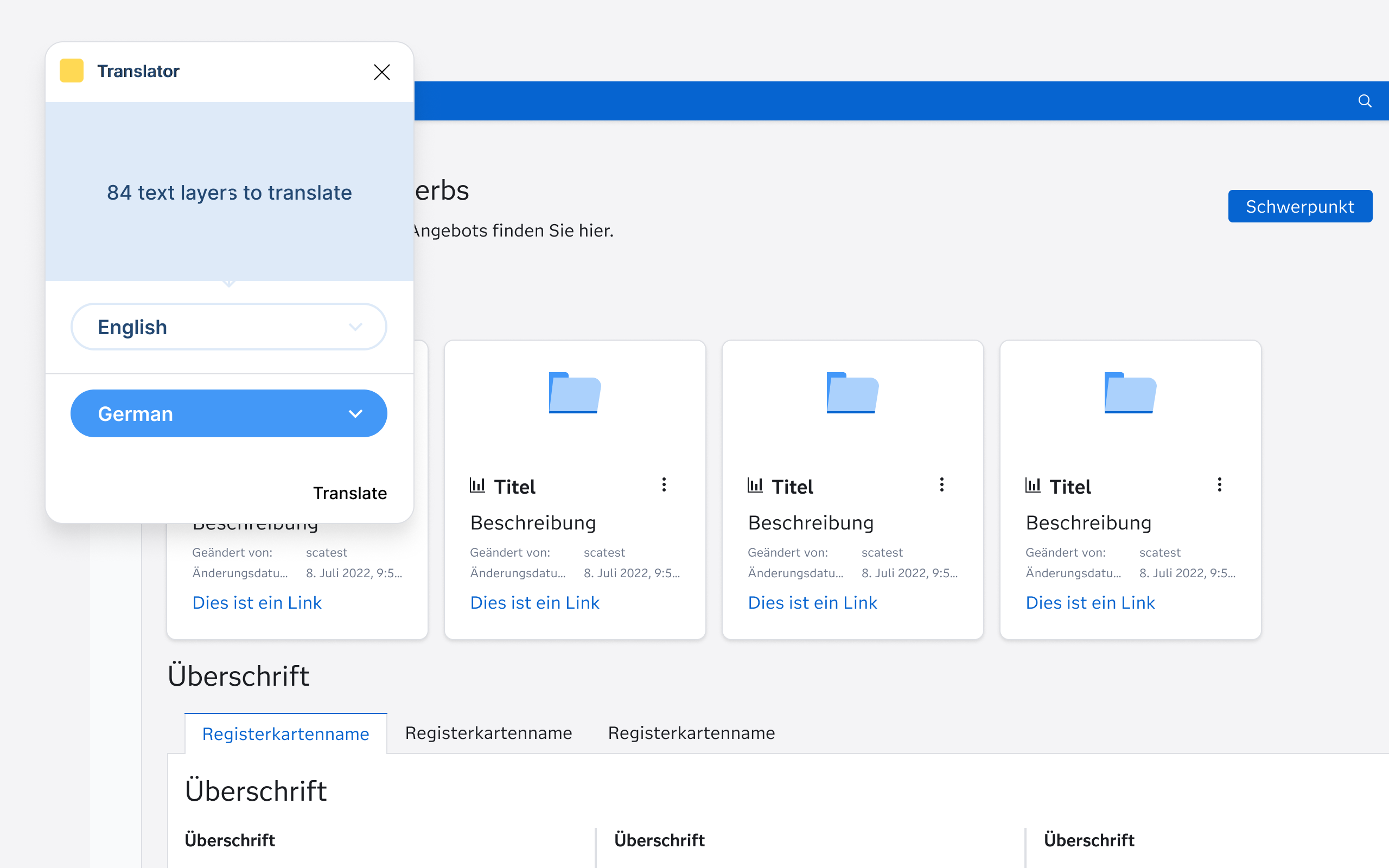
We do not use Figma’s variable feature to define text strings for each locale (e.g., English, Spanish, French) because, given the sheer breadth and depth of our Products and solutions, it would simply be too daunting a task to undertake. For us, using an existing plug-in, such as “Translator,” gives us what we need.
After ensuring all text layers were remapped to variables, along with the “Translator” plug-in, we were able to swap entire screens to a new language. This allowed us to start testing our symbols for unforeseen layout issues.
We discovered that some symbols were not supporting text wrapping when needed (e.g., accommodating longer words in German or shorter ones in Japanese). We isolated those issues and updated them to auto-layout for flexible resizing. This approach ensured all our Figma symbols were scalable and adaptable for multilingual support.
Delivering The System
With our component libraries set up to support localization, we were ready to deliver our component libraries to product designers. As a part of this step, we crafted a “Multilingual Design Cheat Sheet” to help designers understand how to set up their application mockups with Localization and Internationalization in mind.
Multilingual Design Cheat Sheet:
- General Principles
- Design flexible layouts that can handle text wrapping and language-specific requirements such as right-to-left orientations.
- Use real content during design and development to identify localization issues such as spacing and wrapping.
- Research the cultural expectations of your target audience to avoid faux pas.
- Text & Typography
- Use Filament Design Systems fonts to ensure support of all languages.
- Avoid custom fonts that lack bold or italic styles for non-Latin scripts like CJK languages.
- Reserve additional space for languages like German or Finnish.
- Avoid hardcoded widths for text containers and use auto-layout to ensure long text strings are readable.
- The Filament Design System tokens adjust line height per language; make sure you are using variables for line-height.
- Use bold sparingly, as Filament tokens override bold styling in some languages. Instead, opt for alternative emphasis methods (e.g., color or size).
- Layout & Design
- Mirror layouts for RTL languages (e.g., Arabic, Hebrew). Align text, icons, and navigation appropriately for the flow of the language.
- Use auto-layout to accommodate varying text lengths.
- Avoid embedding text in images to simplify localization.
- Allow ample spacing around text elements to prevent crowding.
- Language-Specific Adjustments
- Adapt formats based on locale (e.g., YYYY/MM/DD vs. MM/DD/YYYY).
- Use metric or imperial units based on the region.
- Test alignments and flows for LTR and RTL languages.
- Localization Readiness
- Avoid idioms, cultural references, or metaphors that may not translate well.
- Provide space for localized images, if necessary.
- Use Figma translation plug-ins to test designs for localization readiness and use real translations rather than Lorem Ipsum.
- Test with native speakers for language-specific usability issues.
- Check mirrored layouts and interactions for usability in RTL languages.
Lessons Learned
In summary, building a localization-ready design system was a complex yet rewarding process that taught Mark and me several critical lessons:
- Localization and internationalization must be prioritized early.
Ignoring multilingual principles in the early stages of design creates cascading issues that are costly to fix later. - Semantic tokens are key.
Refactoring our tokens to be more semantic streamlined the localization process, reducing complexity and improving maintainability. - Figma variables are promising but limited.
While Figma Variables introduced new possibilities, their current limitations — such as lack of percentage-based line-height values and manual setup requirements — highlight areas for improvement. - Automation is essential.
Manual efforts, such as recalculating and inputting values for typography and density-specific tokens, are time-intensive and prone to error. Plugins like “Translator” and “Swap Variables” proved invaluable in streamlining this work. - Collaboration is crucial.
Close coordination with front-end developers ensured that our JSON restructuring efforts aligned with performance and usability goals. - Testing with real content is non-negotiable.
Design issues like text wrapping, RTL mirroring, and font compatibility only became apparent when testing with real translations and flexible layouts.
Future Directions
As we look ahead, our focus is on enhancing the Filament Design System to better support global audiences and simplify the localization process for designers:
- Automatic mirrored layouts for RTL languages.
We plan to develop tools and workflows that enable seamless mirroring of layouts for right-to-left languages, ensuring usability for languages like Arabic and Hebrew. - Improved figma integration.
Advocacy for Figma enhancements, such as percentage-based line-height support and better handling of variable imports, will remain a priority. - Advanced automation tools.
Investing in more robust plugins and custom tools to automate the calculation and management of tokens across themes, densities, and locales will reduce manual overhead. - Scalable localization testing framework.
Establishing a framework for native speaker testing and real-world content validation will help us identify localization issues earlier in the design process. - Expanding the multilingual design cheat sheet.
We will continue to refine and expand the cheat sheet, incorporating feedback from designers to ensure it remains a valuable resource. - Community engagement.
By sharing our findings and lessons, we aim to contribute to the broader design community, fostering discussions around integrating localization and internationalization in design systems.
Through these efforts, Mark and I hope to create a more inclusive, scalable, and efficient design system that meets the diverse needs of our global audience while empowering SAS designers to think beyond English-first designs.
Further Reading On SmashingMag
- “Internationalization And Localization For Static Sites,” Sam Richard
- “CSS-Driven Internationalization In JavaScript,” Maksim Chemerisuk
- “How To Conduct Website Localization: Don’t Get Lost In Translation,” Julia Rozwens
- “12 Commandments Of Software Localization,” Zack Grossbart