


How CBD Packaging Color Psychology Drives Sales
For CBD brands, the psychology behind color choices can significantly impact consumer behavior and ultimately drive sales. This article explores how different colors used in CBD packaging affect customers, promote trust, and support branding, all while staying aligned with nature and wellness values.
Color is more than just decoration in packaging—it influences emotions, decisions, and perceptions. For CBD brands, the psychology behind color choices can significantly impact consumer behavior and ultimately drive sales. This article explores how different colors used in CBD packaging affect customers, promote trust, and support branding, all while staying aligned with nature and wellness values.
The Connection Between Color and Emotion in CBD Packaging
Colors can affect how we feel, even before we read a product label. When someone sees a CBD product, the color of the packaging is often the first thing they notice. It forms a quick impression—whether the product feels safe, reliable, organic, or even luxurious.
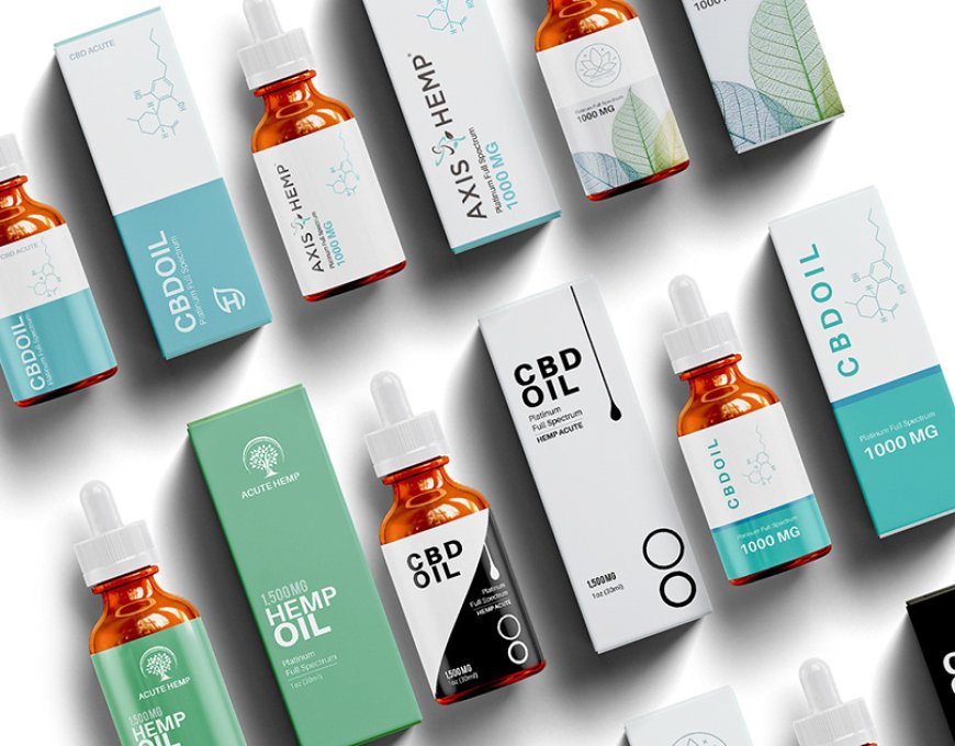
Green, for example, is commonly used in CBD packaging because it symbolizes nature, health, and growth. It's a natural choice since CBD comes from hemp, a plant. Green reassures customers that the product is clean and plant-based. It’s calming and peaceful, which reflects the benefits many seek from CBD.
On the other hand, blue shades are used to create a sense of trust, professionalism, and calmness. This can be especially useful for medicinal CBD products where buyers want to feel confident about their health decisions. Blue tells them the product is reliable and backed by care.
Earth tones like brown and beige often appear in eco-friendly and organic CBD boxes wholesale. These colors highlight sustainability, purity, and honesty. They help brands appear more natural and environmentally responsible, which is important to many modern customers.
Natural Hues That Reflect Wellness and Purity
CBD is all about wellness, relaxation, and natural healing. To reflect these values, many brands choose packaging colors inspired by nature. These shades not only stand out on shelves but also resonate with what customers expect from a CBD product.
Soft greens, earthy browns, and light pastels help create a calm and soothing effect. These colors are subtle but powerful. They speak directly to consumers who value peace, health, and natural remedies. For example, a light sage or olive green suggests a healing and balanced product. It tells a story of connection to the earth.
Neutral tones such as beige, cream, and white suggest cleanliness and simplicity. They create an uncluttered and clear brand image. This appeals to people who are cautious about what they put in their bodies. White also gives a feeling of honesty, which is essential in a market where trust is key.
In the crowded CBD market, bold colors can also play a role. However, they must be used carefully. For instance, a splash of gold can indicate a premium, high-end product. But too much can feel out of place in a wellness-focused space. The balance is key.
Why Minimalistic Colors Enhance Brand Trust
In the world of CBD, less can often be more. Minimalistic color palettes, when used correctly, can build a powerful brand identity. These designs are clean, simple, and modern. They reflect transparency and professionalism, which helps brands gain consumer trust.
Colors like white, grey, or light pastels are commonly used in minimal packaging. These tones allow the product to appear straightforward and honest. They suggest that there is nothing to hide, which is important in an industry that is still earning public confidence.
Minimalist design also focuses on clarity. It removes the clutter and directs attention to the key elements—brand name, dosage, and benefits. This helps consumers feel informed, rather than overwhelmed.
When customers pick up a package that looks clean and modern, they are more likely to think the product is safe and of high quality. This approach appeals to educated consumers who read labels and care about ingredients.
How Color Builds CBD Brand Identity
Every successful brand has a unique identity. In CBD packaging, color plays a big part in that identity. A brand that consistently uses the same color theme across its products becomes more recognizable and trustworthy to customers.
For instance, a brand that always uses earthy tones will be seen as natural and eco-conscious. This becomes part of its image. When customers see those colors, even from a distance, they associate them with that brand and its values.
Color can also help different product lines within the same brand stand out. A sleep aid might use soft blue, while a pain relief product uses green. These differences help customers choose the right product quickly while staying connected to the overall brand style.
Brand identity also includes emotional messaging. Warm tones like orange can suggest energy and enthusiasm. Cool tones like blue and green offer calmness and healing. When a brand picks colors that match its values, it sends a clear and consistent message.
Consumer Behavior and Visual Triggers
Visual elements, especially color, have a strong effect on how customers behave. Studies show that many purchase decisions happen within seconds, based mainly on what we see. In CBD packaging, color is one of the main triggers that push someone to pick up a product.
Consumers looking for relaxation are drawn to calming colors. These include light greens, blues, and lavender. These shades lower tension and reflect the calming effects of CBD. A stressed shopper may unconsciously pick a package that looks peaceful.
When someone needs relief or support for pain, they often look for serious and medical-looking packaging. In these cases, blue and white are effective because they appear professional and clean. These colors also feel safe, which increases confidence in the product.
Bright colors like orange and yellow can trigger curiosity and energy. These are good for CBD products that offer focus or alertness. But they must be balanced so they don’t clash with the wellness message.
Eco-Conscious Colors and Sustainable Branding
Many CBD customers care deeply about the environment. They want products that not only help their health but also support the planet. This makes eco-conscious packaging colors a key part of sustainable branding.
Colors like brown, beige, and olive green instantly suggest nature and earth-friendly values. These shades make the product feel honest, simple, and rooted in nature. They align with what green buyers are looking for—minimal waste and natural ingredients.
Recycled paper packaging often keeps its natural brown tone. This unpolished look adds to the brand’s authenticity. It feels raw and real, rather than overly processed or artificial. This approach helps build trust with eco-aware customers.
Another popular trend is soft pastel tones that feel organic and calm. These colors are often used with soy-based inks and compostable materials. Together, they create packaging that reflects care for the planet and the consumer.
Role of Packaging Color in Product Differentiation
In a crowded CBD market, standing out is a challenge. One way brands succeed is by using color to clearly show how one product differs from another. Packaging color helps customers quickly understand what the product is for and how it can help them.
For example, a brand might use purple for CBD meant to help with sleep. Purple has long been connected with calm, night, and rest. When a shopper sees this, they don’t have to read the full label to know what it offers.
Similarly, bright colors can be used for CBD infused with vitamins or energy boosters. A bold yellow or orange hints at morning use and motivation. These visual clues speed up decision-making and reduce confusion on the shelf.
For skincare CBD products, soft pinks or creams can suggest softness and beauty. These gentle colors appeal to those looking for self-care or anti-aging items. Meanwhile, strong colors like dark green can suggest strength, ideal for muscle relief creams or oils.
By organizing products through color, brands make shopping easier. Customers feel confident when colors match their needs. They are less likely to make mistakes and more likely to return to the same brand.
Conclusion
Color psychology is a powerful tool in CBD packaging that directly influences how customers feel, decide, and purchase. By choosing colors that reflect natural wellness, build trust, and match specific product purposes, CBD brands can connect deeply with their target audience. From calming greens and blues to earthy browns and minimalistic neutrals, each shade plays a specific role in shaping consumer perception.
Whether a brand wants to appear eco-conscious, premium, or therapeutic, color can deliver that message instantly. In a competitive market where first impressions matter, smart color choices don’t just attract attention—they drive sales and long-term loyalty. For businesses scaling through cbd boxes wholesale, leveraging the emotional impact of color ensures packaging remains both effective and memorable across every retail platform.