


Hero Sections: A small visual study
A 'Hero' is a large banner at the top of a website's home page. As it is the first thing a visitor sees when they enter a website, it's the one chance to make a first impression. What makes a good Hero section A central graphic This can be an image or a video. For our purposes, we'll only need an image. This image should be high-quality and meaningful. A purely decorative image won't do. It should convey the proposition of a fall festival in some capacity. The image shouldn't be too busy either. Negative space is necessary, as the purpose of the central graphic is to complement the other components of the section, not override them. Text The text block is where you capture interest. It consists of one or both of two parts: Tagline The headline delivers the core message in just a few words. Luckily, we already have a very fitting tagline: "Real Farm Fun". This should be displayed in a large, strong, legible font. Description This text supports the tagline, or provides additional information. It should be concise, but can be longer than the tagline. Additionally, it should be amply spaced away from other components, so that it doesn't clutter them, and draws attention to itself Call-To-Action (CTA) This is the single most important part of the section. It is the subject of the section's inspiration, and the driver for interaction with the website. Typically, the CTA is shown as a button, or a link. It should be visually prominent, standing out so the viewer cannot miss it. Just like every other component, it should have ample breathing room to draw attention and reduce clutter. Finally, if there is more than one CTA, they should be distinct from each other, with a dominant action and others being secondary Let's take a look at other great Hero sections Text over images: Here, white text is placed directly over an image. No blurring, no text backgrounds. Despite being overlaid on a sky, the text remains easily readable because the sky is sufficiently dark, providing just enough contrast. What we can learn from this? When using a graphic as a backdrop, always compare its most extreme colors with the website's theme colors to ensure sufficient contrast and readability Unlike the previous example, the graphic here has way too much contrast to be used as a backdrop, as is the case for most product graphics. So instead, this hero clearly separates the text from the graphics by placing them on either side. However, it cleverly corrects the visual balance by adding another graphic, and another text (user stats), but with the sides swapped. With that, text and graphics are evenly distributed over the screen. What can we learn from this? By thoughtfully distributing both text and graphics, you can prevent visual imbalances. This can be done by adding additional supporting text, and secondary graphics

A 'Hero' is a large banner at the top of a website's home page. As it is the first thing a visitor sees when they enter a website, it's the one chance to make a first impression.
What makes a good Hero section
A central graphic
This can be an image or a video. For our purposes, we'll only need an image.
This image should be high-quality and meaningful. A purely decorative image won't do. It should convey the proposition of a fall festival in some capacity.
The image shouldn't be too busy either. Negative space is necessary, as the purpose of the central graphic is to complement the other components of the section, not override them.
Text
The text block is where you capture interest. It consists of one or both of two parts:
Tagline
The headline delivers the core message in just a few words. Luckily, we already have a very fitting tagline: "Real Farm Fun". This should be displayed in a large, strong, legible font.
Description
This text supports the tagline, or provides additional information. It should be concise, but can be longer than the tagline.
Additionally, it should be amply spaced away from other components, so that it doesn't clutter them, and draws attention to itself
Call-To-Action (CTA)
This is the single most important part of the section. It is the subject of the section's inspiration, and the driver for interaction with the website.
Typically, the CTA is shown as a button, or a link. It should be visually prominent, standing out so the viewer cannot miss it. Just like every other component, it should have ample breathing room to draw attention and reduce clutter.
Finally, if there is more than one CTA, they should be distinct from each other, with a dominant action and others being secondary
Let's take a look at other great Hero sections
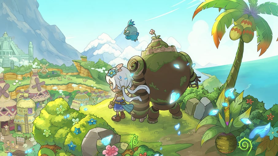
- Text over images: Here, white text is placed directly over an image. No blurring, no text backgrounds. Despite being overlaid on a sky, the text remains easily readable because the sky is sufficiently dark, providing just enough contrast.
What we can learn from this?
When using a graphic as a backdrop, always compare its most extreme colors with the website's theme colors to ensure sufficient contrast and readability

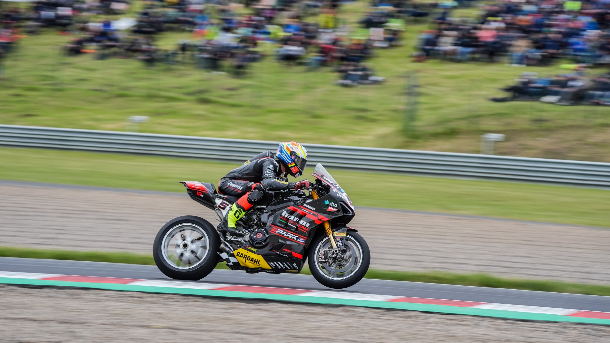
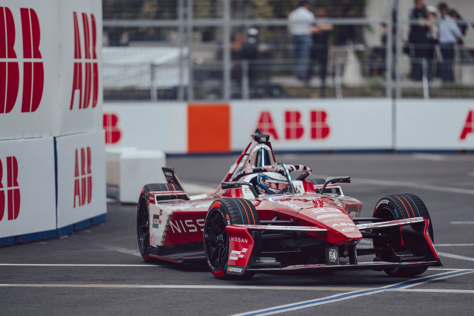
Unlike the previous example, the graphic here has way too much contrast to be used as a backdrop, as is the case for most product graphics.
So instead, this hero clearly separates the text from the graphics by placing them on either side. However, it cleverly corrects the visual balance by adding another graphic, and another text (user stats), but with the sides swapped. With that, text and graphics are evenly distributed over the screen.
What can we learn from this?
By thoughtfully distributing both text and graphics, you can prevent visual imbalances. This can be done by adding additional supporting text, and secondary graphics