


_Aleksey_Funtap_Alamy.jpg?width=1280&auto=webp&quality=80&disable=upscale#)


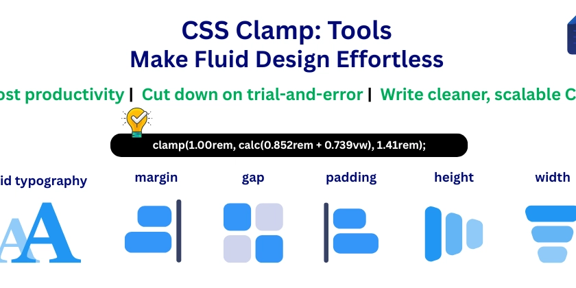
CSS Clamp: Tools That Make Fluid Design Effortless
Responsive design used to mean endless media queries, rigid breakpoints, and lots of trial and error. But modern CSS offers something better — the power of clamp(). Still, using clamp() across different layout properties (like spacing, widths, typography) isn't always intuitive. So let’s simplify it.
Responsive design used to mean endless media queries, rigid breakpoints, and lots of trial and error.
But modern CSS offers something better — the power of clamp().
Still, using clamp() across different layout properties (like spacing, widths, typography) isn't always intuitive.
So let’s simplify it.