


Bright Colors or More Text? How to Design a Good Menu Board
Wondering if bold colors or detailed text work best on a menu board? Learn how to design an effective menu board that grabs attention and boosts sales.
It is quite simple to find oneself in the trap of either overdoing or underdoing when it comes to making an eye-catching and effective restaurant digital menu board. Should you use popping colors? Or should text be more to be clear? The solution is in moderation. Your restaurant digital menu must be more than just a representation of your brand; it needs to be designed in such a way that customers can make quick, confident choices.
The Importance of Design in a Restaurant Digital Menu
You never get a second chance at a first impression-this is particularly true in a quick service restaurant. Your restaurant digital menu board is your silent salesperson. It affects what the customers order, the time they take to make decisions as well as the amount they expend. Confusion and lost sales may be the results of a cluttered or boring display whereas a visually strategic display may bring in larger orders and happiness.
Bright Colors: Where Minimal Is Maximal
Vivid colors are eye-catching, yet at some point, there may be an overload. Select one or two brand colors as the background and highlight featured products, combos, or new arrivals with bright colors. To take some examples, a bright red or orange could be used to draw attention to limited-time deals, and a green accent could suggest freshness or health-conscious choices.
Be careful not to overuse high-saturation colors together. Adhere to a color scheme that goes well with the theme of your restaurant. And be sure to test your color scheme in the real world lighting conditions to check readability.
What Is too Much Text?
Your digital menu in the restaurant must only provide enough information to enable the customers make fast decisions. Do not use lengthy descriptions and use large text that can be readable at a distance. Use straightforward names of products, brief descriptions (where necessary) and prices.
Bullet points, brief phrases and symbols can work miracles on clarity. Perhaps you even do not have to clarify what a BBQ Bacon Burger is, in that case, ensure that it is readable, placed well and preferably with an enticing picture too.
Top Tips to an Excellent Menu Board Design
• Hierarchy of Use: Popular or profitable items should be bigger and more central.
• Be Consistent: Fonts and colors used in the board should be the same.
• Rotate Content: Feature various items at various times of the day (breakfast, lunch, happy hour).
• Use Motion Thoughtfully: Animations are visually appealing, however, excessive movement may distract or disorient.
Pictures or No Pictures?
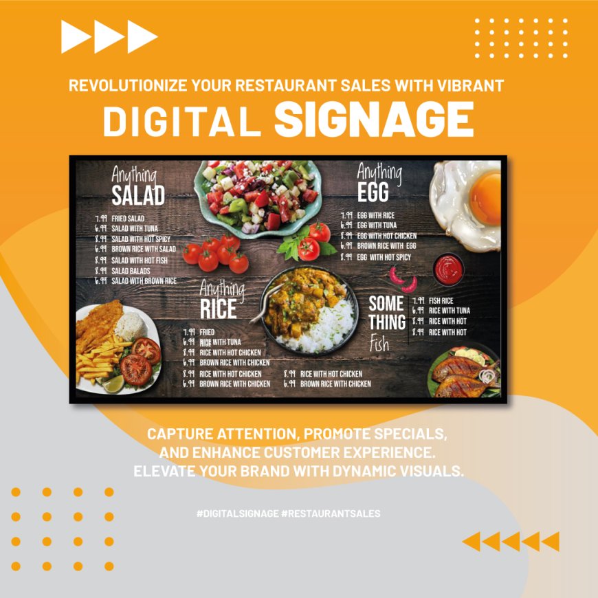
Inclusion of good quality food pictures can enhance the interaction with the menu- provided they are professional and drool worthy. An out of focus or dim photograph may be worse than useless. When you decide to use visuals, use only several important items to keep visual cleanliness.
To conclude, the ideal restaurant digital menu board is balanced: it is not too bright and chaotic or too informative and wordy. With a judicious use of color and text, your menu will be more than a simple list, it will be a marketing tool that will increase your sales and will enhance the customer experience.