


★ WebKit Adds Support for ‘text-wrap: pretty’, Now Shipping in Safari Technology Preview
I think it’s a good start, and I couldn’t be happier that the WebKit team is even tackling the problem at all. As Simmons notes, line-wrapping layout in web browsers has, until now, been very crude — and the web has been around a long time.

Jen Simmons, writing on the WebKit blog, “Better Typography With text-wrap pretty”:
For over 30 years, the web had only one technique for determining where to wrap text.
The browser starts with the first line of text, and lays out each word or syllable, one after another until it runs out of room. As soon as it has no more space to fit another word/syllable, it wraps to the next line (if wrapping is allowed). Then it starts on the next line, fitting all the content it can… then when it runs out of room, it wraps… and starts working on the next line.
It’s always thinking about only one line at a time. It wraps whenever it needs, after it’s fit the maximum amount of content on the previous line. If hyphenation is turned on, it will hyphenate whatever word is last on the line, at whatever point leaves as much of the word on the previous line as possible. Nothing else is taken into consideration — which is why text on the web has bad rag, rivers, short last lines, and hyphenation that makes no sense.
This is not required by the fact that text is laid out by a computer. For decades, software like Adobe InDesign and LaTeX has evaluated multiple lines of text at a time as they decide where to end one line and begin the next. It’s just that the web didn’t use a multiline algorithm. Until now.
We are excited to bring this capability to the web for the first time, in Safari Technology Preview 216.
I’ve turned this on here at Daring Fireball, at least as an experiment. (Look at me, fast adopter of novel CSS features.) I have mixed feelings about the results. Here are saved PDFs showing the rendering of my “How Many New iPhones Can Fit on a Freight Plane?” article from earlier today: first with traditional text-wrap: auto line wrapping, and second with WebKit’s new text-wrap: pretty in STP 216. Looking at each paragraph by itself, there’s no question this new layout algorithm is, well, prettier. The problem I see is going from one paragraph to another. Within a paragraph, WebKit’s new pretty wrapping definitely makes lines a more uniform width. But in some cases it so narrows an entire paragraph that it makes going from one paragraph to the next jarring. Line-to-line the new algorithm looks better, but paragraph-to-paragraph I think it looks worse.
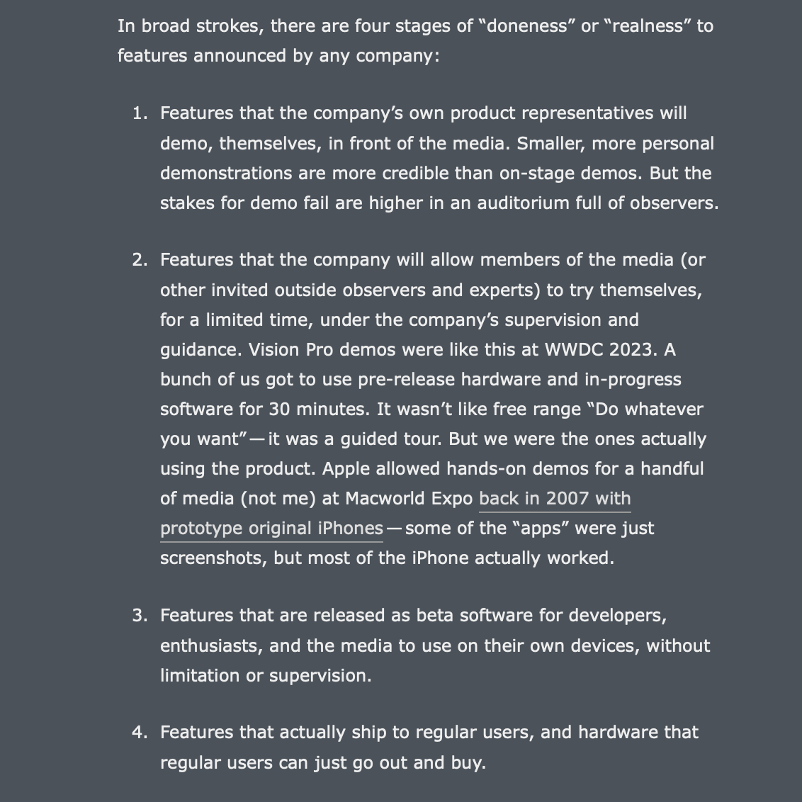
One specific example, from my longest recent article. First, with the old text-wrap: auto:
Here’s that same list with the new text-wrap: pretty in STP 216:
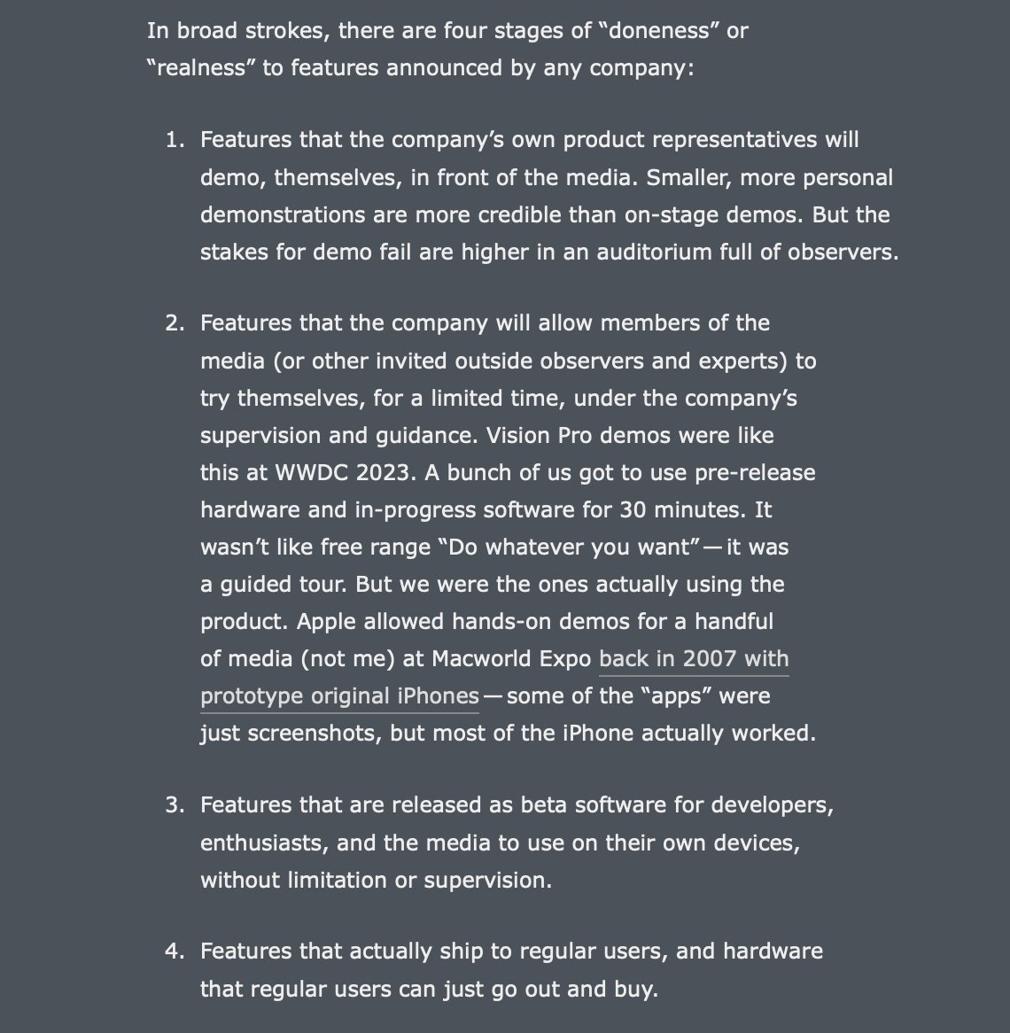
With the new text-wrap: pretty, the entire paragraph for the first list item is noticeably wider than the subsequent ones (and noticeably wider than the one preceding the list). To me, there’s so much disparity between paragraph widths that it’s distracting, even though each paragraph, taken on its own, looks better. But you don’t take paragraphs on their own when reading.
I suspect (informed by toying with Simmons’s fun interactive demo page using STP 216) that this initial WebKit text-wrap: pretty layout algorithm works better with wider column widths than are currently specified on Daring Fireball. With a little more width to play with, there seems to be less back-and-forth change from paragraph to paragraph.
So, for my purposes, this might be yet another improvement that will need to wait for the long-promised-but-who-knows-when-it-might-actually-happen-but-I-swear-I-think-about-it-quite-a-bit-and-a-few-years-ago-even-had-something-in-motion-but-then-let-the-project-drop layout modernization here. But, even with a nice responsive design, column widths on phones are inherently narrow, so I think this algorithm ought to be tweaked to render more consistent paragraph widths in narrow-ish columns.
But I think it’s a good start, and I couldn’t be happier that the WebKit team is even tackling the problem at all. As Simmons notes, line-wrapping layout in web browsers has, until now, been very crude — and the web has been around a long time.