


SVG dimension attributes and adaptive icons
Table of contents SVG viewport, viewbox and preserveAspectRatio preserveAspectRatio Adaptive icons or logos Image sprites Defining media queries inside SVG SVG viewport, viewbox and preserveAspectRatio SVG viewport is a "window" through which we can see an svg element. It is defined by the width and height attributes of the SVG element. We can specify a length unit with the following units: em, ex, px, pt, pc, cm, mm, in, %. By default the used length units are px. The important detail to remember is that SVG viewport is not browser viewport. The browser viewport refers to the part of the browser window, which shows the part of the document a user sees. The viewBox for the outermost svg element defines the rectangle in user space that is mapped to the borders of the SVG viewport. The viewBox value is a sequence of four numbers: min-x, min-y (define the origin of coordinates _), width and height (_specifies viewBox size). All elements inside the svg element are drawn in the viewBox coordinate system. Let's look at how SVG reacts to a change of min-x. We create a simple circle and change only viewBox: If SVG attributes viewbox and width are ommited, the SVG element will be rendered with a width of 300px. For height the value is 150px. In case, viewbox is specified, default values of these dimension attributes are auto (100%). preserveAspectRatio If we have the same aspect ratio for both viewBox and viewport, viewBox coordinate system just stretches to fill the viewport area. What happens if the aspect ratio is different? How can we specify position and scale? Here comes the preserveAspectRatio attribute. Let's look at different preserveAspectRatio values for the base example: Here, we have different aspect ratio for viewBox (1:1) and for viewport (2:1). That's why a circle doesn't fit in viewport. We don't see preserveAspectRatio attribute in this example, but without specifying it looks like this: preserveAspectRatio="xMidYMid meet" The preserveAspectRatio attribute's value consists of two parameters: align: none - fit inside the viewport without maintaining the aspect ratio: combination of xMin/xMid/xMax and yMin/yMid/yMax: meetOrSlice: meet (default) - the entire viewBox should be visible inside the viewport; slice - the viewBox fills the entire viewport: Adaptive icons or logos It's cool if we provide simplified versions of icons on smaller viewport sizes. Image sprites The technique is to group different small images into a single file (the user downloads only that file from the server). Then, relative to the viewport size, we display only the part we need with the help of CSS. Let's look at our composite image: The plan is to display the rightmost icon on small screens and the leftmost on large ones. Defining media queries inside SVG Since SVG can contain its own CSS rules, we can simply do the same just inside SVG:
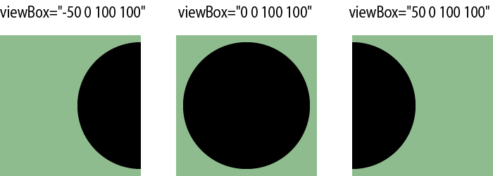
Table of contents
-
SVG viewport, viewbox and preserveAspectRatio
- preserveAspectRatio
-
Adaptive icons or logos
- Image sprites
- Defining media queries inside SVG
SVG viewport, viewbox and preserveAspectRatio
SVG viewport is a "window" through which we can see an svg element. It is defined by the width and height attributes of the SVG element. We can specify a length unit with the following units: em, ex, px, pt, pc, cm, mm, in, %. By default the used length units are px.
The important detail to remember is that
SVG viewportis notbrowser viewport. Thebrowser viewportrefers to the part of the browser window, which shows the part of the document a user sees.
The viewBox for the outermost svg element defines the rectangle in user space that is mapped to the borders of the SVG viewport. The viewBox value is a sequence of four numbers: min-x, min-y (define the origin of coordinates _), width and height (_specifies viewBox size). All elements inside the svg element are drawn in the viewBox coordinate system.
Let's look at how SVG reacts to a change of min-x. We create a simple circle and change only viewBox:
 xmlns="http://www.w3.org/2000/svg" viewBox="0 0 100 100">
  cx="50" cy="50" r="40" />
If SVG attributes
viewboxandwidthare ommited, the SVG element will be rendered with awidthof300px. Forheightthe value is150px. In case,viewboxis specified, default values of these dimension attributes areauto(100%).
preserveAspectRatio
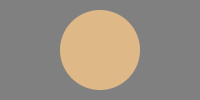
If we have the same aspect ratio for both viewBox and viewport, viewBox coordinate system just stretches to fill the viewport area. What happens if the aspect ratio is different? How can we specify position and scale? Here comes the preserveAspectRatio attribute.
Let's look at different preserveAspectRatio values for the base example:
 xmlns="http://www.w3.org/2000/svg"
 viewBox="0 0 100 100"
 width="200"
 height="100"
 style="background-color: gray"
>
  cx="50" cy="50" r="40" fill="burlywood" />
Here, we have different aspect ratio for
viewBox(1:1) and forviewport(2:1). That's why a circle doesn't fit inviewport. We don't seepreserveAspectRatioattribute in this example, but without specifying it looks like this: preserveAspectRatio="xMidYMid meet"
The preserveAspectRatio attribute's value consists of two parameters:
-
align:
-
none- fit inside the viewport without maintaining the aspect ratio: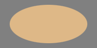
- combination of
xMin/xMid/xMaxandyMin/yMid/yMax: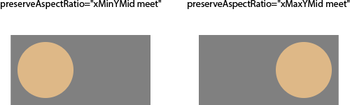
-
-
meetOrSlice:
-
meet(default) - the entire viewBox should be visible inside the viewport; -
slice- the viewBox fills the entire viewport:
-
Adaptive icons or logos
It's cool if we provide simplified versions of icons on smaller viewport sizes.
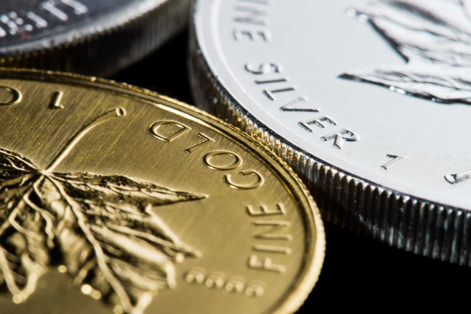
Image sprites
The technique is to group different small images into a single file (the user downloads only that file from the server). Then, relative to the viewport size, we display only the part we need with the help of CSS.
Let's look at our composite image:
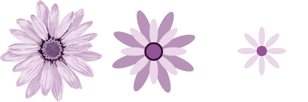
The plan is to display the rightmost icon on small screens and the leftmost on large ones.
Defining media queries inside SVG
Since SVG can contain its own CSS rules, we can simply do the same just inside SVG: