


How to use CSS variables like a pro
Written by Idorenyin Obong✏️ Editor's note: This article was updated by Emmanuel John in March 2025 to include instructions on setting CSS variables dynamically with JavaScript, differentiate between CSS and SASS variables, and troubleshoot common developer issues with CSS variables. CSS offers many predefined standard key-value-based properties for styling semantic HTML elements. However, while designing webpages, developers often need to repetitively use the same values for properties in several segments of stylesheets — for example, while using a primary accent color for various webpage elements. CSS now supports using custom properties, also known as CSS variables, to avoid repetitive CSS property values. Like any popular programming language, CSS also implements variables for writing clean code with a productive assignment and retrieval syntax, scoping support, and fallback values. In this tutorial, we’ll first demystify CSS variables and then build four simple projects that utilize them. Some basic CSS knowledge is required to follow along with this tutorial. Let’s dive in! What are CSS variables? CSS variables are user-defined values that can be reused throughout a stylesheet. They are also known as custom properties*.* The -- prefix and var() function is used to define and access CSS variables respectively: :root { --primary-color: #3498db; } button { background-color: var(--primary-color); } Unlike traditional CSS properties, CSS variables can be modified dynamically with JavaScript using (element.style.setProperty). CSS variables can be changed in one place and all elements using it update automatically. They can be defined within selectors or globally using (:root ). One of the most common use cases for CSS variables is managing websites in which numerous values are similar to those in the document. This helps to reduce the friction associated with refactoring or updating your code. What we’ll build in this tutorial To solidify our knowledge about CSS variables, we’ll build four very simple projects: Button variations — This concept is popular in Bootstrap, where certain elements share CSS rules that give them a default design but are differentiated by colors or other properties Theme-based design — Specifically, a light-and-dark theme manipulated by JavaScript A responsive login form — We’ll display different layouts on desktop, tablet, and mobile screens JavaScript-free dynamic elements — This project generates a colorful native checkbox list Each project should provide insights into how we can use CSS variables to take care of a wide variety of use cases. Also referred to as custom properties or cascading variables, CSS variables have myriad use cases. How to declare and use CSS variables CSS variables can be declared in two ways (-- prefix and @property at-rule). -- prefix The -- prefix declares variables in two ways (globally and locally). The former uses the :root selector to define global variables: :root { --primary-color: blue; --font-size: 16px; } While the latter defines a variable inside specific elements: .card { --card-bg: lightgray; background-color: var(--card-bg); } Here, --card-bg is only accessible inside .card. Global variables are accessible everywhere in the stylesheet. @property at-rule The @property at-rule allows you to be more expressive with the definition of CSS variables by allowing you to define their type, control inheritance, and set default values which act as fallback. Using the @property at-rule ensures more predictable behavior. @property --card-color { syntax: ""; inherits: false; initial-value: #FFFFFF; } Here, --card-color is declared as a CSS variable that expects value. The inherits:false; property prevents it from being inherited by child elements, and initial-value:#FFFFFF; sets a default color when no value is assigned. How to use variables in CSS** CSS variables can be applied to elements using the var() function: button { background-color: var(--primary-color); font-size: var(--font-size); } If the value of --primary-color is updated, all the elements using it will automatically change. CSS variables inheritance** Like traditional CSS properties, CSS variables follow standard property rules — i.e., they inherit, can be overridden, and adhere to the CSS specificity algorithm. The value of an element is inherited from its parent elements if no custom property is defined in a specific child element, as shown in the following example. The HTML: Heading text Paragraph text The CSS: .container { --padding: 1rem; } .post { --padding: 1.5rem; } .post-content { padding: var(--padding); } In this case, the .post-content selector inherits padding value from its direct parent, .post, with the value of 1.5rem rather than 1rem. You can use Chrome
Written by Idorenyin Obong✏️
Editor's note: This article was updated by Emmanuel John in March 2025 to include instructions on setting CSS variables dynamically with JavaScript, differentiate between CSS and SASS variables, and troubleshoot common developer issues with CSS variables.
CSS offers many predefined standard key-value-based properties for styling semantic HTML elements. However, while designing webpages, developers often need to repetitively use the same values for properties in several segments of stylesheets — for example, while using a primary accent color for various webpage elements.
CSS now supports using custom properties, also known as CSS variables, to avoid repetitive CSS property values. Like any popular programming language, CSS also implements variables for writing clean code with a productive assignment and retrieval syntax, scoping support, and fallback values.
In this tutorial, we’ll first demystify CSS variables and then build four simple projects that utilize them. Some basic CSS knowledge is required to follow along with this tutorial. Let’s dive in!
What are CSS variables?
CSS variables are user-defined values that can be reused throughout a stylesheet. They are also known as custom properties*.* The -- prefix and var() function is used to define and access CSS variables respectively:
:root {
  --primary-color: #3498db;
}

button {
  background-color: var(--primary-color);
}
Unlike traditional CSS properties, CSS variables can be modified dynamically with JavaScript using (element.style.setProperty). CSS variables can be changed in one place and all elements using it update automatically. They can be defined within selectors or globally using (:root ).
One of the most common use cases for CSS variables is managing websites in which numerous values are similar to those in the document. This helps to reduce the friction associated with refactoring or updating your code.
What we’ll build in this tutorial
To solidify our knowledge about CSS variables, we’ll build four very simple projects:
- Button variations — This concept is popular in Bootstrap, where certain elements share CSS rules that give them a default design but are differentiated by colors or other properties
- Theme-based design — Specifically, a light-and-dark theme manipulated by JavaScript
- A responsive login form — We’ll display different layouts on desktop, tablet, and mobile screens
- JavaScript-free dynamic elements — This project generates a colorful native checkbox list
Each project should provide insights into how we can use CSS variables to take care of a wide variety of use cases.
Also referred to as custom properties or cascading variables, CSS variables have myriad use cases.
How to declare and use CSS variables
CSS variables can be declared in two ways (-- prefix and @property at-rule).
-- prefix
The -- prefix declares variables in two ways (globally and locally). The former uses the :root selector to define global variables:
:root {
  --primary-color: blue;
  --font-size: 16px;
}
While the latter defines a variable inside specific elements:
.card {
  --card-bg: lightgray;
  background-color: var(--card-bg);
}
Here, --card-bg is only accessible inside .card. Global variables are accessible everywhere in the stylesheet.
@property at-rule
The @property at-rule allows you to be more expressive with the definition of CSS variables by allowing you to define their type, control inheritance, and set default values which act as fallback. Using the @property at-rule ensures more predictable behavior.
@property --card-color {
syntax: "" ;
inherits: false;
initial-value: #FFFFFF;
}
Here, --card-color is declared as a CSS variable that expects inherits:false; property prevents it from being inherited by child elements, and initial-value:#FFFFFF; sets a default color when no
How to use variables in CSS**
CSS variables can be applied to elements using the var() function:
button {
  background-color: var(--primary-color);
  font-size: var(--font-size);
}
If the value of --primary-color is updated, all the elements using it will automatically change.
CSS variables inheritance**
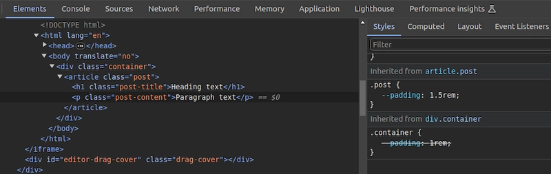
Like traditional CSS properties, CSS variables follow standard property rules — i.e., they inherit, can be overridden, and adhere to the CSS specificity algorithm. The value of an element is inherited from its parent elements if no custom property is defined in a specific child element, as shown in the following example.
The HTML:
 class="container">
   class="post">
     class="post-title">Heading text
     class="post-content">Paragraph text
The CSS:
.container {
  --padding: 1rem;
}

.post {
  --padding: 1.5rem;
}

.post-content {
  padding: var(--padding);
}
In this case, the .post-content selector inherits padding value from its direct parent, .post, with the value of 1.5rem rather than 1rem. You can use Chrome DevTools to see from where the specific CSS variable value gets inherited, as shown in the following preview: You can use CSS variable inheritance to pass variable values from parent elements to child elements without re-declaring them in selectors. Also, overriding variable values is possible as traditional CSS properties.
CSS variables cascading
CSS cascade rules handle the precedence of CSS definitions that come from various sources. CSS variables also follow the standard cascade rules as any other standard properties. For example, if you use two selectors with the same specificity score, the variable assignment order will decide the value of a specific CSS variable.
A variable assignment in a new CSS block typically overrides the existing precedence and re-assigns values to variables. Let’s understand variable cascading rules with a simple example.
The HTML:
class="lbl lbl-ok">OK
The CSS:
.lbl {
  --lbl-color: #ddd;
  background-color: var(--lbl-color);
  padding: 6px;
}

.lbl-ok { --lbl-color: green }

/* --- more CSS code ---- */
/* ---- */

.lbl-ok { --lbl-color: lightgreen }
The above CSS selectors have the same specificity, so CSS uses cascading precedence to select the right lbl-color value for elements. Here, we’ll get the lightgreen color for the span element since lightgreen is in the last variable assignment. The color of the label may change based on the order of the above selectors.
CSS variables also work with developer-defined cascade layers that use the @layer at-rule. To demonstrate this, we can add some cascade layers to the above CSS snippet:
@layer base, mods;

@layer base {
  .lbl {
    --lbl-color: #ddd;
    background-color: var(--lbl-color);
    padding: 6px;
  }
}

@layer mods {
  .lbl-ok { --lbl-color: lightgreen }
}
You can check how cascading rules overwrite variable values with Chrome DevTools: 
Fallback and invalid values**
When using custom properties, you might reference a custom property that isn’t defined in the document. You can specify a fallback value to be used in place of that value.
The syntax for providing a fallback value is still the var() function. Send the fallback value as the second parameter of the var() function:
:root {
  --light-gray: #ccc;
}

p {
  color: var(--light-grey, #f0f0f0); /* No --light-grey, so #f0f0f0 is
  used as a fallback value */
}
Did you notice that I misspelled the value --light-gray? This should cause the value to be undefined, so the browser loads the fallback value, #f0f0f0 for the color property.
A comma-separated list is also accepted as a valid fallback value. For example, the following CSS definition loads red, blue as the fallback value for the gradient function:
background-image: linear-gradient(90deg, var(--colors, red, blue));
You can also use variables as fallback values with nested var() functions. For example, the following definition loads #ccc from --light-gray if it’s defined:
color: var(--light-grey, var(--light-gray, #f0f0f0));
Note that it’s generally not recommended to nest so many CSS functions due to performance issues caused by nested function parsing. Instead, try to use one fallback value with a readable variable name. If your web app should work on older web browsers that don’t support custom properties, you can define fallback values outside of the var() function as follows:
p {
  color: #f0f0f0; /* fallback value for older browsers */
  color: var(--light-grey);
}
If the browser doesn’t support CSS variables, the first color property sets a fallback value. We’ll discuss browser compatibility in the upcoming section about browser support for the CSS variables feature.
Meanwhile, custom properties can get invalid values due to developer mistakes. Let’s learn how the browser handles invalid variable assignments and how to override the default invalid assignment handling behavior:
:root {
  --text-danger: #ff9500;
}

body {
  --text-danger: 16px;
  color: var(--text-danger);
}
In this snippet, the --text-danger custom property was defined with a value of #ff9500. Later, it was overridden with 16px, which isn’t technically wrong. But when the browser substitutes the value of --text-danger in place of var(--text-danger), it tries to use a value of 16px, which is not a valid property value for color in CSS.
The browser treats it as an invalid value and checks whether the color property is inheritable by a parent element. If it is, it uses it. Otherwise, it falls back to a default color (black in most browsers).
This process doesn’t bring the correct initial value defined in the :root selector block, so we have to define custom properties with the accepted type and initial value using the @property at-rule, as shown in the following code snippet:
@property --text-danger {
syntax: "" ;
inherits: true;
initial-value: #ff9500;
}
body {
--text-danger: 16px;
color: var(--text-danger);
}
Now, the browser renders the expected text color even if we assign an invalid value within the body selector.
Creating scoped CSS variables
As discussed in previous examples, it’s possible to create global CSS variables using either :root or @property at-rule. Also, creating local variables is possible by defining variables inside child element selectors. For example, a variable defined inside header won’t be exposed to body.