


★ Fox’s New Scorebug Graphic Design, and Our Innate Resistance to Change
Different doesn’t always mean better. But better necessarily implies different.

A scorebug is industry jargon for the sub-genre of chyron (itself jargon) that shows ever-present information about a televised sporting event while you’re watching. These graphics display the teams, the score, the time remaining, and other metadata pertaining to the current situation. The current ball/strike count in baseball. The down and yards-to-go in football. The shot clock in basketball. That sort of thing.1
Fox was the broadcast network for Super Bowl 59 yesterday, in which the Philadelphia Eagles utterly embarrassed the Kansas City Chiefs 40-22 (but which felt like a score of 114-0). The NFL rotates the Super Bowl annually between the networks that broadcast games. Fox has a tradition of unveiling updated on-screen graphics packages when it has the Super Bowl. This year, they didn’t just tweak the design, they completely re-thought it and redesigned it.
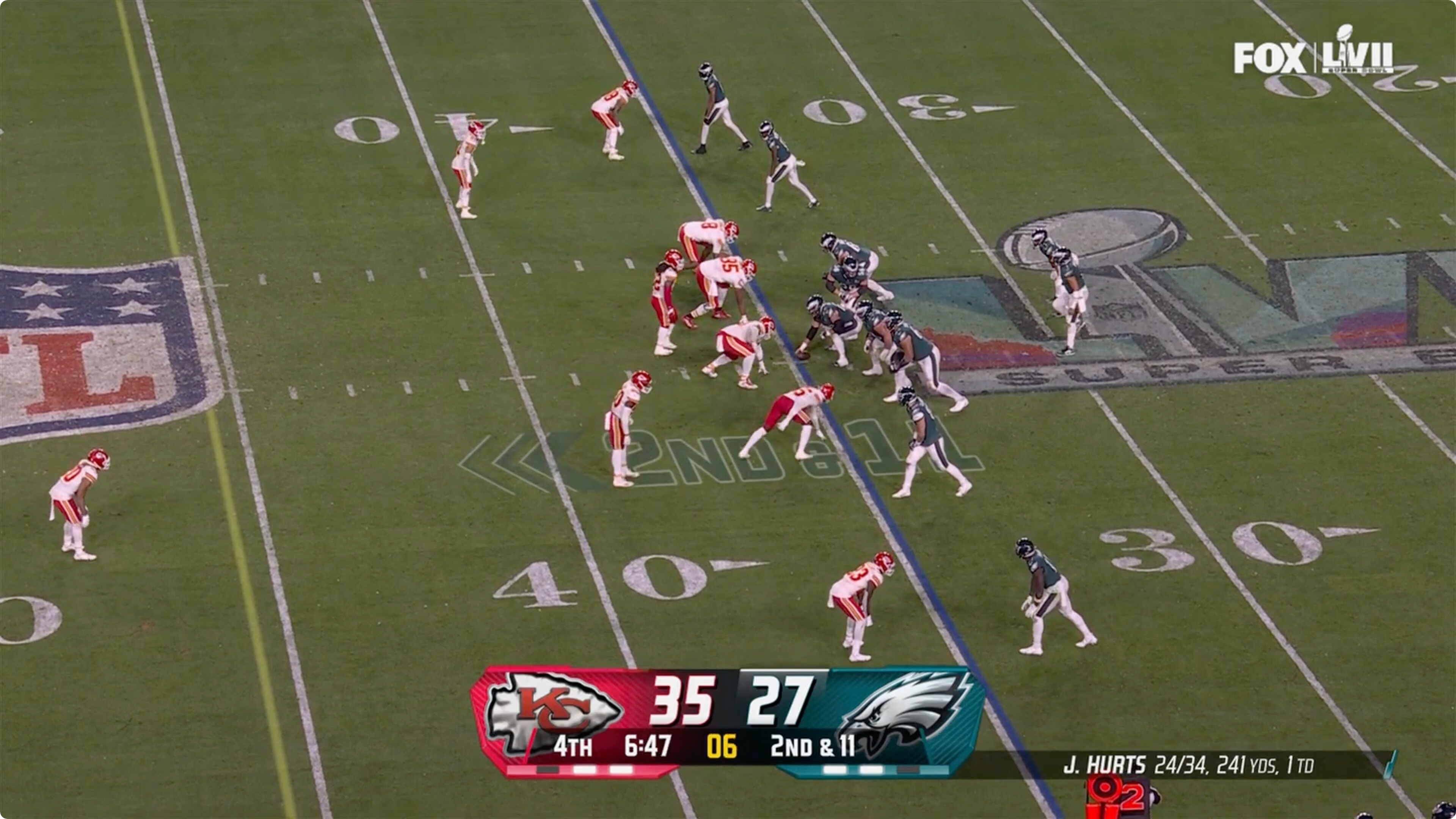
First, here’s Fox’s familiar old scorebug, as captured from their broadcast of Super Bowl 57, a game that also pitted the Eagles against the Chiefs.2 two years ago
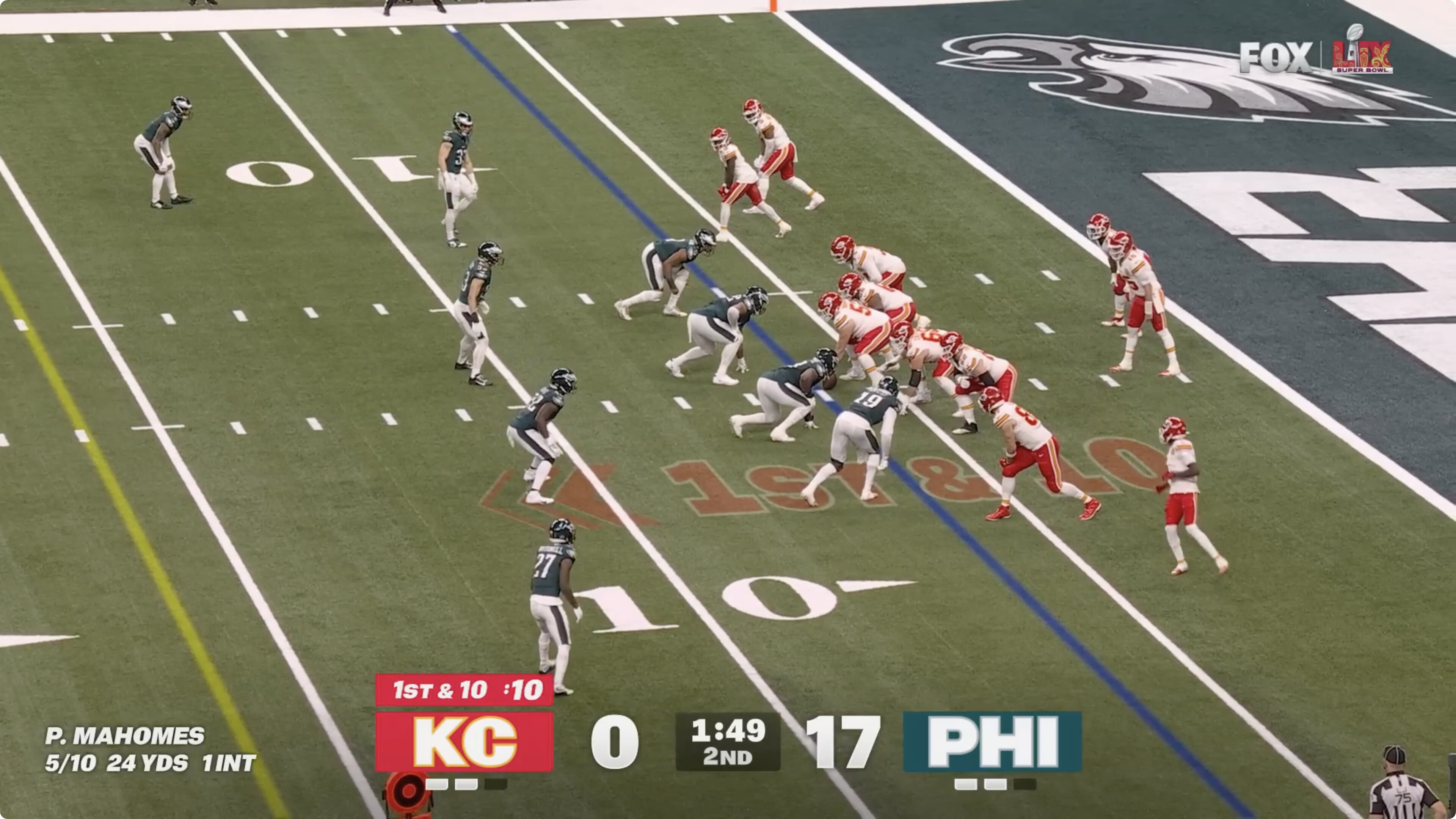
Here’s the new scorebug they debuted last night, in front of the biggest sports audience of the year:
I noticed the change immediately (of course), and my knee-jerk instant reaction was negative. Too big, too bold, too different. Don’t like. That’s natural. Human beings evolved to be alarmed by change. If everything looks the same as usual, everything is probably as safe as usual. If something looks jarringly different, it might be a sign that you’re about to be killed. (Evolutionarily speaking.)
So I started studying and considering the changes to Fox’s scorebug. I quickly not only warmed up to the new scorebug, I decided I really like it. It’s better than Fox’s old one, and better than every other network’s (which all largely look the same), in almost every single regard.
I like the new scorebug so much I (cross-)posted about it to social media during the game. My posts, in order of engagement: Threads (~6,600 likes, ~700 replies and reposts), Bluesky (~3,900 likes, ~600 replies and reposts), and Mastodon (179 likes, 53 replies and reposts).
No change an app developer can make will generate more commentary and emotional feedback from users than changing the app’s icon. Everyone sees an app’s icon, and has an opinion about about them. That opinion, after a change, is usually “I like the old icon and hate the new one.” Likewise with a game broadcast’s scorebug — everyone sees them, and everyone has an opinion when they change. Most reactions to Fox’s new scorebug were negative, and many of those were really negative. Yahoo Sports ran a story under the headline “Super Bowl: Fox Sports Debuts New Scorebug, to Universally Negative Reaction”. The sports media-focused site Awful Announcing ran a take by Drew Lerner under the headline “Please Stop Debuting New Scorebugs During the Super Bowl” (subhead: “Can’t I just watch one Super Bowl without having to learn a new graphic?”). I have not even come close to reading all the replies to my social media take (well, except on Mastodon — it was quick to catch up there), but if you peruse them, you’ll be quick to see that most replies are from people who despise the change. A representative tasting:
“It looks as if they just let an intern knock something up in PowerPoint and didn’t bother having someone check it first. Awful.