


![‘Andor’ Star Varada Sethu on Cinta’s [SPOILER], Her Future With Vel and Killing Tay Kolma: ‘It’s Like Death When She Turns Up’](https://variety.com/wp-content/uploads/2025/05/cinta.jpg?#)


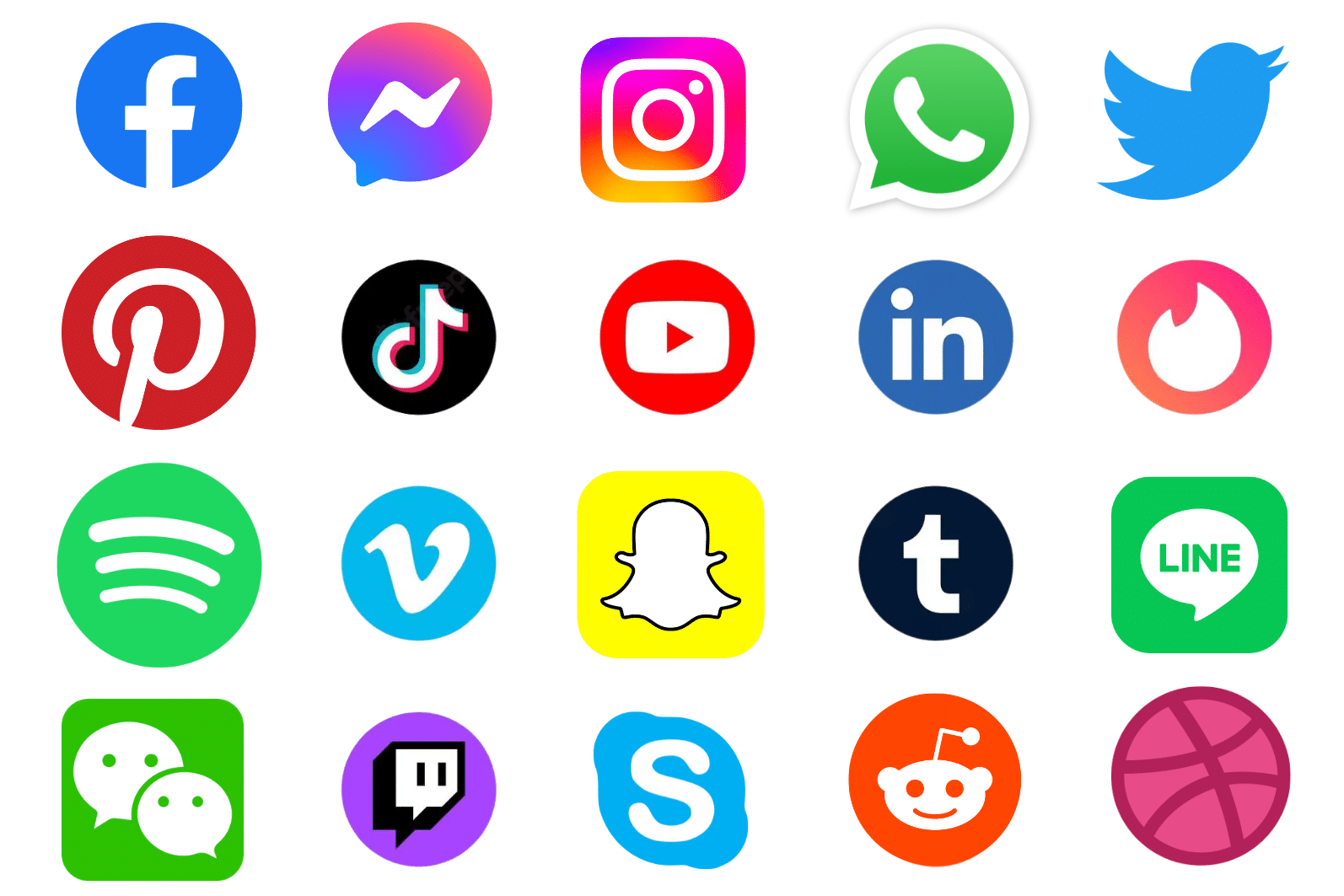
15 Best Social Media Logos of Today & Their Stories
Discover the fascinating stories and hidden meanings behind the 10 best social media logos of today. Explore the evolution and symbolism of each iconic design.
In today’s digital age, social media has become an integral part of our daily lives. From connecting with friends and family through social media to discovering new trends and products, social media has revolutionized the way we interact with the world around us.
But have you ever stopped to wonder about the stories behind the official logos of these popular social media logos and giants? How did they come up with their iconic designs, and what do they represent?
In this article, we’ll take a deep dive into the fascinating history and inspiration behind the 15 used social media icons of today.
While you’re here you may also want to read our posts on the best city logos and the world’s best logos.
15 Best Social Media Logos & Their Meanings
1. Facebook: Connecting the World

Did you know that the first logo of Facebook was actually a mashup of Al Pacino’s face and binary code? That’s right, back in 2003, Mark Zuckerberg created a website called Facemash that let Harvard students rate each other’s looks.
A year later, Zuckerberg launched TheFacebook, a website that connected Harvard students online. The logo was a simple text with a blue The and a white Facebook on a blue background. It looked like something you would see on a college bulletin board.
In 2005, Zuckerberg decided to drop the The from the name and bought the domain facebook.com for a whopping $200,000. He also hired Mike Buzzard of Cuban Council to design a new logo that featured a lowercase f in white on a blue background.
The logo was sleek and simple, and the blue color was chosen partly because Zuckerberg was color blind and partly because it symbolized purity and optimism.
In 2015, the logo got a makeover with a new custom font and a slightly lighter shade of blue. The font was designed by Eric Olson of Process Type Foundry and aimed to make the logo more friendly and approachable. It looked like something you would see on a social media app.
2. Instagram: Capturing Life’s Moments

When Instagram was first launched in 2010, it had a logo that was designed by Cole Rise, a professional photographer and designer who was hired by the app’s co-founder, Kevin Systrom.
The logo featured a camera icon with a rainbow stripe that was based on a Bell & Howell camera from the 1950s. The logo was meant to evoke nostalgia and represent the app’s focus on photo-sharing and visual storytelling.
Over the years, the logo has undergone a few changes, including minor tweaks to the design and the introduction of a simplified, monochromatic version in 2016.
However, the logo has always retained the camera and rainbow elements, which serve as a visual representation of the app’s mission to connect people through creative and diverse visual content from all over the world.
3. X / Twitter: The Sound of a Tweet

The Twitter / X logo has evolved several times since the social media platform’s launch in 2006. Initially, graphic designer Linda Gavin created the first logo, which featured a stylized bird with a tuft of feathers at the top, accompanied by the word “Twitter” in a smooth and rounded font in light blue. This logo was intended to reflect the simplicity and friendliness of the platform and was used from 2006 to 2010.
In 2010, Twitter’s creative director Doug Bowman updated the logo with a more refined and streamlined bird icon, commonly known as the “twitter bird.” The bird had a lighter blue color palette and a slightly slimmer, more aerodynamic shape.
In 2012, Twitter introduced a significant redesign of its logo, which featured a simpler, more abstract version of the bird icon. Despite the change, the logo retained its distinctive blue color.
This logo was also designed by Doug Bowman, who said that the logo was based on three overlapping circles that represent the network of connections and conversations on Twitter. The logo also dropped the word “Twitter” and became just the bird icon.
The logo was meant to represent the simplicity, accessibility, and universality of the platform. As of 2023, the name Twitter has been changed to X and the new logo is shown below.

4. YouTube: Broadcasting Yourself

YouTube is a video-sharing website based in San Bruno, California, that was started by three former PayPal employees–Chad Hurley, Steve Chen, and Jawed Karim– in February 2005. In November 2006, Google acquired the site for US$1.65 billion and made it one of its subsidiaries.
The official YouTube logo has been relatively consistent over the years. Unlike some other social media and internet startups that emerged around the same time, it has not made drastic changes to its logo – and that may be why it has avoided the backlash that often follows social media logo name.
Most of YouTube’s logo updates have been so subtle, in fact, that you might have missed them altogether, but the logo has actually changed several times – and here we’ll show you every version that has been used so far.
The video sharing platform has been around for an amazing 17 years now, and you probably know that black logotype and red square very well.
Apart from a series of more radical temporary Black History Month logos in February of this year, the official YouTube logo itself has only changed as much as YouTube felt it had to in order to stay fresh and relevant, making sure that it’s always been easy to recognize along the way.
It may not be on our list of the best logos ever. But the YouTube logo history can still teach us a few things about how a successful logo can be gradually improved and simplified over time.
5. Snapchat: A Modern-Day Camera

Do you know the story behind the Snapchat logo? The friendly ghost that greets you every time you open the app has a fascinating history that goes back to 2011, when Snapchat was first launched as Picaboo.
The logo was created by Evan Spiegel, one of the co-founders of Snapchat, who drew it on his computer in one night. He chose a yellow color for the logo because no other app had it at that time.
He also named the ghost Ghostface Chillah, after his favorite rapper from the Wu-Tang Clan. The logo was meant to represent the ephemeral nature of the app, where photos and videos disappear after a few seconds.
Over the years, the logo has changed slightly, becoming more simple and sleek. The ghost lost its face and tongue, and the outline became thicker. But the essence of the logo remained the same: a playful and friendly symbol that invites you to snap and chat with your friends.
6. LinkedIn: Building Professional Networks

The LinkedIn logo has evolved over the years to reflect the company’s growth and vision. The logo was first introduced in 2003 when LinkedIn was launched as a professional networking site.
The logo consisted of the word “LinkedIn” in black, with the letters “in” inside a blue rounded rectangle.
The logo was meant to convey the idea of being connected and linked in with other professionals. In 2011, the logo changed slightly, with the word “LinkedIn” in blue and the rectangle in a lighter shade of blue. The logo also dropped the slogan “Relationships Matter” which was used since 2008. The logo was meant to emphasize the company’s name and brand identity.
In 2019, the logo changed again, with a simpler and sleeker design. The logo featured the word “LinkedIn” in a darker shade of blue and a thinner font. The rectangle was also removed, leaving clear space and only the word “in” in white.
The logo was meant to represent the company’s simplicity, accessibility, and universality. In 2021, the logo changed slightly once more, with a bolder and more modern look. The logo featured the word “LinkedIn” in a custom font called “LinkedIn New”, which was based on the original font but with some modifications. The logo also used a brighter shade of blue and a thicker outline.
7. TikTok: Short-Form Videos, Big Impact

TikTok is a video-sharing app that has become one of the most popular social media platforms in the world. The app allows users to create and watch short videos with music and sound effects. But how did TikTok come to be and what does its logo mean? Let’s take a look at the history and inspiration behind the TikTok logo.
TikTok originated in China in 2016, when ByteDance, a tech company, introduced a video-sharing app called A.me. The app was later renamed Douyin, which translates to “shaking sound” in Chinese.
Initially, the app’s logo featured a musical note that appeared to be shaking and also resembled the letter D. The designer who created the logo was inspired by the energy and vibrancy of live music performances. The logo’s background was black to generate excitement, while the cyan and fuchsia shadows on the musical note created a contrasting effect.
In 2017, ByteDance decided to expand Douyin to the international market and rebranded it as TikTok. The logo remained the same except for the name change.
The same year, ByteDance also acquired Musical.ly, another video-sharing app that had a large and loyal fan base among young users. Musical.ly was known for its lip-syncing and comedy videos, which fit well with TikTok’s features.
In 2018, TikTok and Musical.ly merged into one app, keeping the TikTok name and logo. This gave TikTok a huge boost in its user base and popularity. The app also started to diversify its content and attract more celebrities and influencers.
8. Pinterest: Inspiring Ideas and Creativity

Pinterest is a social media app that lets users find and share images of their interests. The logo is a red circle with a white P that looks like a pin. The logo was made by Michael Deal and Juan Carlos Pagan in 2011 and has changed a little since then. Here are the changes:
- In 2011, the logo had a red script wordmark and a tilted P icon with a shadow.
- In 2012, the logo removed the shadow and changed the font to a sans-serif one. The P icon was straightened and aligned with the wordmark.
- In 2016, the logo changed the font to a custom one called Neue Haas Grotesk. The P icon had a sharper tip and a rounder curve.
- In 2020, the logo changed the red color to a brighter one and adjusted the spacing of the letters. The P icon was enlarged and moved closer to the wordmark.
The Pinterest logo means:
- The red color means passion, energy, excitement, and love.
- The white color means simplicity, purity, elegance, and clarity.
- The circle shape means unity, completeness, harmony, and community.
- The P letter means the name of the app and the feature of pinning images.
- The stylized font means creativity, uniqueness, style, and personality.
9. Reddit: The Front Page of the Internet

The Reddit logo has undergone some minor changes since the platform’s launch in 2005. Originally, the logo featured the word “Reddit” in a script font in black with a cartoon alien mascot, known as Snoo, standing next to it. This logo was designed by Alexis Ohanian, one of the co-founders of Reddit.
In 2014, Reddit made a minor update to its logo, which involved simplifying its mascot, Snoo, into a minimalist design and placing it inside a circular shape. The new logo featured a more vibrant shade of orange-red, with the wordmark changed to white and an orange dot added above the letter i. This logo redesign was created to improve versatility and scalability across various platforms and devices.
In 2018, Reddit underwent a significant redesign of its platform, including a refresh of its logo that aimed to reflect the company’s growth and evolution over time. The new logo features a brighter orange-red color and an adjusted spacing of the letters. The mascot Snoo is now enlarged and placed closer to the wordmark.
Overall, the evolution of the Reddit logo reflects the platform’s ongoing commitment to innovation and evolution, as it seeks to stay ahead of the curve and continue to provide its users with a dynamic, engaging online community.
10. WhatsApp: Connecting People Across the Globe

The WhatsApp logo has undergone several changes since the app’s launch in 2009. Originally, the logo featured a simple green speech bubble. This logo was designed by one of the co-founders of the app, Jan Koum.
In 2013, WhatsApp made a slight modification to add more to its logo, adding a small phone icon inside the speech bubble to highlight its messaging and communication capabilities.
The following year, Facebook acquired WhatsApp, and the company launched a comprehensive rebranding initiative, including a significant update to the logo. The new design features a sleek and modern appearance, with a simplified phone icon on the left, and the green speech bubble on the right, aligned with the wordmark. The “WhatsApp” name was updated with a new font and a slightly bolder, more prominent design.
In 2021, WhatsApp introduced another minor update to its logo, altering the shape of the phone icon to a more rounded square icon while also adjusting the placement of the speech bubble icons in relation to it.
The overall look and feel of the logo remained largely the same, but the changes were intended to make it easier to recognize and more visually appealing.
Overall, the evolution of the WhatsApp logo reflects the app’s growth and evolution over time, as it has become a must-have tool for communication and other social media around the world.
11. Tumblr: A Creative Hub for Expression and Connection

Tumblr is a microblogging and a social media networking platform that was founded by David Karp in 2007. The name “tumblr” comes from the word “tumblelog”, which is a type of blog that features short-form, mixed-media posts. The original tumblr logo was designed by Karp himself, and featured a lowercase “tumblr” in a sans-serif font with a blue dot over the “i”. The logo was meant to convey simplicity, elegance and creativity.
In 2013, Yahoo acquired tumblr for $1.1 billion, allowing the platform to maintain its brand identity and autonomy. However, in 2018, tumblr caused controversy by announcing its decision to ban all adult content from the site.
This move followed a child pornography incident that resulted in the removal of the tumblr app from the Apple App Store. The decision faced criticism from users and creators who felt that the ban impeded their expression and community on the platform.
In 2019, tumblr was sold again, this time to Automattic, the parent company of WordPress, for a reported $3 million. Automattic promised to preserve tumblr’s culture and values, and to invest in its growth and innovation.
The current tumblr logo is a slight modification of the original one, with a darker shade of blue and a more rounded font. The logo still reflects tumblr’s identity as a platform for creative and diverse content.
12. Skype: Bringing People Together from Anywhere in the World

Lastly, we have the Skype logo and it has changed several times since its launch in 2003. The original logo was red and had a gradient wordmark. In 2005, the logo changed to blue, which is still the main color today.
In 2012, after being acquired by Microsoft, the logo adopted a metro-style mark with a simplified foreground. In 2017, the logo was further simplified to reflect the design language of the Office 365 applications. Lastly in 2019, a new logo icon was unveiled with a darker shade of blue and a more rounded font.
13. Mastodon: A Symbol for Open Social Sharing

When Mastodon was introduced in 2016, its original logo featured a playful and distinctive “M” inside a chat bubble, hinting at both its name and its decentralized, community-driven nature.
The design was created by its founder, Eugen Rochko, and collaborators in the open-source community. The logo used a soft, rounded font style and vibrant blue color, aiming to feel friendly, non-corporate, and approachable, aligned with Mastodon’s mission to offer a more ethical, user-controlled alternative to mainstream social networks.
In 2022, the logo received a refresh. The updated mark kept the signature “M” but adopted a bolder, more modern design with improved scalability across digital platforms. The visual language evolved, but the spirit of decentralization and openness remained central.
Through these changes, Mastodon’s logo has consistently reflected the platform’s core values: open communication, user empowerment, and a break from the centralized control of traditional social media giants.
14. Threads: The Loop of Digital Conversation

When Meta launched Threads in July 2023, it introduced a logo that sparked widespread curiosity and discussion. The design, resembling a stylized “@” symbol, was not just a nod to digital communication but also a blend of cultural and typographic inspirations.
According to Instagram head Adam Mosseri, the Threads logo draws inspiration from the classic Internet symbol “@,” representing a person’s username, individual independence, and voice. The logo interprets “@” as an unbroken line, inspired by the loop that occurs when a thread starts, symbolizing continuous conversation.
Beyond its digital symbolism, the logo also pays homage to the Tamil alphabet. Meta has stated that the Threads logo is inspired by the Tamil letter “ம” (ma), which consists of a circle with a vertical line running through it, mirroring the logo’s design.
The logo is crafted using Instagram’s proprietary sans-serif typeface, Instagram Sans, which combines circular and square elements to create a modern and sleek appearance. This design choice ensures the logo is scalable and recognizable across various digital platforms.
In essence, the Threads logo encapsulates the app’s mission: to foster continuous, open conversations in a modern, user-centric environment, bridging digital communication with cultural significance.
15. Roblox: Building Blocks of a Brand
Roblox didn’t just create a platform, it created a universe where imagination drives everything. And its logo journey reflects that evolution.
In its early days, the logo leaned into energy and play. Bold red letters and blocky styling symbolized the core idea behind Roblox: a space for users to build, create, and explore. It wasn’t polished, but it captured the raw creativity of its young, growing community.
As the platform gained momentum, the logo kept up. In 2005, it shifted to a 3D-style block font, adding depth to mirror the immersive, user-built games taking shape. A year later, the typeface evolved again, this time into a fun, sketch-like style with overlapping red letters, making it instantly recognizable to a generation of young players.
Then came 2017. Roblox unveiled a cleaner, more professional look with a custom version of Gill Sans Ultra Bold. The new icon, featuring two squared “O”s, with the first tilted became a symbol of motion, structure, and progression.
In 2022, the logo was refined again. The updated Gotham typeface gave it a more mature, balanced look, signaling Roblox’s growth from a playful game creator to a full-scale metaverse platform. One tilted “O” remains, anchoring the brand’s creative roots while embracing a broader, more diverse audience.
Through every phase, the Roblox logo has remained a reflection of its core idea: a world where anyone can create and everyone can play.
Importance of a Good Social Media Logo Design
Having a good logo for social media is crucial for any business or organization. A well-designed social media logo helps establish brand recognition, recall, and loyalty among potential customers and partners.

It communicates the values, personality, and mission of the brand, and creates an emotional connection with the target audience. A good logo sets a brand apart from the competition, conveys professionalism, and makes a positive first impression.
In today’s competitive marketplace, having a good logo is no longer a luxury, but a necessity for building a strong, memorable, and successful brand.
It can help you achieve the following:
Stand Out from Competition
The core purpose of a logo design is to distinguish a brand from the competition. A logo is the face of your brand, and it plays a vital role in establishing brand recognition and recall among potential customers.
A well-designed logo helps to create a memorable and positive first impression, which sets your brand apart from others in your industry.

While a website or logo is a superficial element of branding, it carries the reputation of your brand. Your audience associates your website or logo with the quality of the products and services you provide.
A good logo can create a sense of trust and reliability, while a poorly designed logo can give a negative impression and turn customers away.
Ultimately, if your brand performs well, your logo will differentiate you from the competition. It’s a visual representation of your brand identity and values, and it helps to establish an emotional connection with your audience.
Connect With Your Audience
Connecting with your audience is an important aspect of branding, and a good logo can help to naturally draw the attention of your audience.

An attractive logo can help to drive traffic towards your brand, ultimately leading to conversions and sales.
On the other hand, if your logo is not visually appealing, it will be challenging to grab the attention of your target audience.
Boost Loyalty, Gain Competitive Edge
Finally, having a great logo can not only help to improve brand loyalty but also give you a competitive advantage in your industry. A well-designed logo can become instantly recognizable and a powerful symbol of your brand identity, which your customers can proudly associate themselves with.
Get ready to discover the secrets behind the logos that have become synonymous with the platforms we know and love.
Best Social Media Logos Summary
The stories behind the top 15 social media icons of today reveal fascinating insights into the evolution and significance of these brands.
From the bird app icon that symbolizes Twitter’s mission of spreading ideas like birdsong, to the “thumbs up” icon that represents Facebook’s goal of connecting people and creating positive interactions, each social media logo has a unique story to tell.
By understanding the history and symbolism behind these latest social media icons and logos, we can gain a deeper appreciation for the impact that social media has had on our lives and the role that these platforms will continue to play in shaping our digital world.