


Today was wild! We finally wrapped up our Threat Intelligence Visualization Framework project — and trust me, it felt like we were taming cyber chaos into clean, beautiful graphs. Let’s dive into how we pulled it off (and no, it wasn’t just endless caffeine... though that helped too). Fetching the Threat Data First things first, we fetched datasets from two heavy hitters in cybersecurity: MITRE ATT&CK (the go-to for attack techniques) NIST (for standards and frameworks) We loaded the MITRE dataset straight into Python. Raw and messy — just how hackers like it. Time to clean it up. Pre-processing: Cyber Data Laundry Day We cleaned and structured the MITRE dataset — removed weird characters, fixed broken formats, and got everything nice and tidy. Saved the shiny new version as processed_mitre_data.json — because no one likes dirty data. Making Cyber Threats Math-Friendly Next, we had to vectorize those scary-sounding attack descriptions. We used TF-IDF to turn text into numbers. (Translation: we taught Python to understand cyberattacks like it’s reading cricket scores.) Attack Techniques: Assemble! Once the data was vectorized, we let KMeans Clustering loose on it. We told it to find 5 different clusters — meaning it grouped similar attack techniques together based on how they "sounded" mathematically. Result? Attack techniques making new best friends. We saved this as clustered_mitre_data.json — our very own cyber Hogwarts Houses. Eye Candy: Visualizations Now the real fun started: 3D Scatter Plot using Plotly ➔ because boring 2D is so 2005. Network Graph with NetworkX ➔ showing how different attacks are related. This made the threats pop visually — like seeing villains in a Marvel crossover. Dashboard Time We built a full-blown interactive dashboard using Dash: Dropdown menus to filter clusters. Dynamic updates in real-time. A super clean, hacker-chic UI. All running locally on Kali Linux — the true home turf for cybersecurity nerds. Testing & Final Polish We put the app through its paces: Smooth interactivity? ✅ Real-time cluster selection? ✅ No weird bugs? (Well, after fixing a few...) ✅ The final dashboard was
Today was wild! We finally wrapped up our Threat Intelligence Visualization Framework project — and trust me, it felt like we were taming cyber chaos into clean, beautiful graphs.
Let’s dive into how we pulled it off (and no, it wasn’t just endless caffeine... though that helped too).
- Fetching the Threat Data First things first, we fetched datasets from two heavy hitters in cybersecurity:
MITRE ATT&CK (the go-to for attack techniques)
NIST (for standards and frameworks)
We loaded the MITRE dataset straight into Python. Raw and messy — just how hackers like it. Time to clean it up.
Pre-processing: Cyber Data Laundry Day
We cleaned and structured the MITRE dataset — removed weird characters, fixed broken formats, and got everything nice and tidy.
Saved the shiny new version as processed_mitre_data.json — because no one likes dirty data.Making Cyber Threats Math-Friendly
Next, we had to vectorize those scary-sounding attack descriptions.
We used TF-IDF to turn text into numbers.
(Translation: we taught Python to understand cyberattacks like it’s reading cricket scores.)Attack Techniques: Assemble!
Once the data was vectorized, we let KMeans Clustering loose on it.
We told it to find 5 different clusters — meaning it grouped similar attack techniques together based on how they "sounded" mathematically.
Result? Attack techniques making new best friends.
We saved this as clustered_mitre_data.json — our very own cyber Hogwarts Houses.
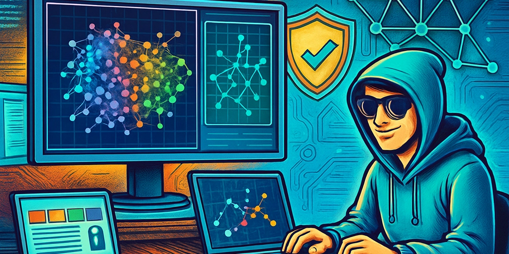
- Eye Candy: Visualizations Now the real fun started:
3D Scatter Plot using Plotly ➔ because boring 2D is so 2005.
Network Graph with NetworkX ➔ showing how different attacks are related.
This made the threats pop visually — like seeing villains in a Marvel crossover.
- Dashboard Time We built a full-blown interactive dashboard using Dash:
Dropdown menus to filter clusters.
Dynamic updates in real-time.
A super clean, hacker-chic UI.
All running locally on Kali Linux — the true home turf for cybersecurity nerds.
- Testing & Final Polish We put the app through its paces:
Smooth interactivity? ✅
Real-time cluster selection? ✅
No weird bugs? (Well, after fixing a few...) ✅
The final dashboard was