


Progressive web app styling
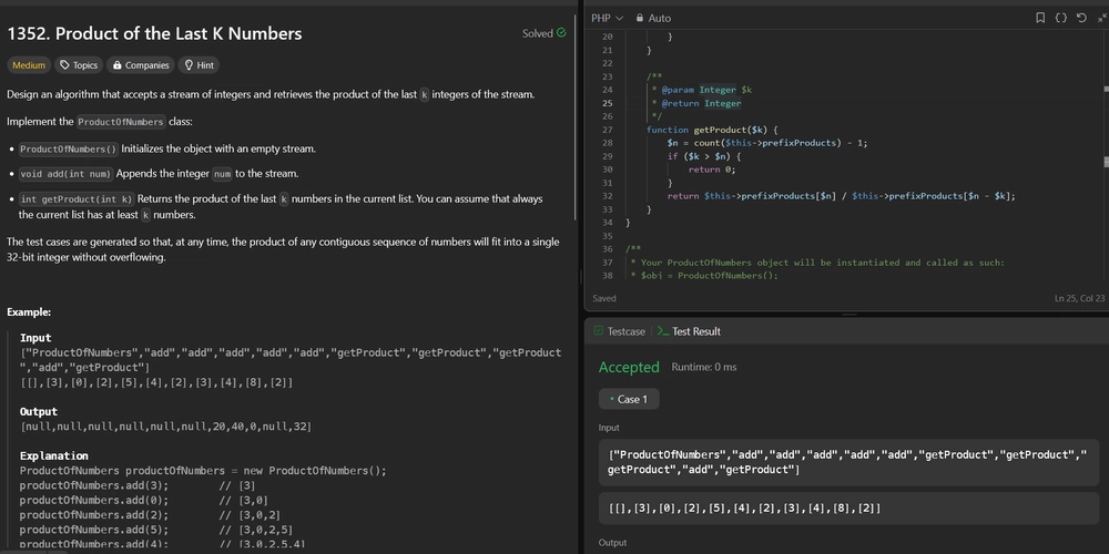
Recently I have worked on adding styles for a progressive web application. It is a Ruby on Rails application. Here are some key learnings I noted down: To make your button look and feel more like a mobile app button, you can enhance it with the following adjustments: Add a subtle shadow: This gives the button a slightly raised appearance, making it look tappable. Adjust padding: Make the button larger and more finger-friendly for touch screens. Rounded corners: Increase the border radius to make it more modern and appealing. Ripple or press effect: Simulate a tactile response when the user taps on it. Color contrast: Make the colors pop and ensure they adhere to accessibility standards. Focus state: Provide visual feedback for accessibility of the button. Focus effect: Add visual feedback when the input is focused. Finger friendly design: Ensure input fields are finger-friendly for better usability. Placeholder styling: Ensure placeholder text with some styling which will not draw much attention Here's an example of a well-styled button for mobile-friendly applications: .btn { background-color: #fbf9f4; border: 1px solid #897b51; border-radius: 1rem; /* Increased for a more modern look */ cursor: pointer; color: #897b51; padding: 0.75rem 2rem; /* Larger padding for touch-friendly size */ text-transform: uppercase; transition: all 0.3s ease; font-size: 1rem; /* Slightly larger font for readability */ box-shadow: 0 4px 6px rgba(0, 0, 0, 0.1); /* Subtle shadow for raised effect */ &:hover { background-color: #d3b88a; color: #fff; box-shadow: 0 6px 8px rgba(0, 0, 0, 0.15); /* Enhance shadow on hover */ } &:active { transform: scale(0.97); /* Slight press effect */ box-shadow: 0 2px 4px rgba(0, 0, 0, 0.2); /* Reduced shadow on press */ } &:focus { outline: none; box-shadow: 0 0 0 3px rgba(205, 151, 0, 0.4); /* Focus ring for accessibility */ } &.primary { background-color: #cd9700; color: #f4f0e8; box-shadow: 0 4px 6px rgba(0, 0, 0, 0.2); .icon { fill: #f4f0e8; } } } Additional Notes: Padding and font-size: Make sure the button size adheres to the Apple and Google Material design guidelines for touch targets. Interactive feedback: You can implement ripple effects for a material design feel. This we can do using Javascript OR CSS as well. While I haven't implemented this yet, it could add a nice touch in some scenarios. Test on devices: Always test the button on different mobile devices to ensure usability and consistency.
Recently I have worked on adding styles for a progressive web application. It is a Ruby on Rails application. Here are some key learnings I noted down:
To make your button look and feel more like a mobile app button, you can enhance it with the following adjustments:
- Add a subtle shadow: This gives the button a slightly raised appearance, making it look tappable.
- Adjust padding: Make the button larger and more finger-friendly for touch screens.
- Rounded corners: Increase the border radius to make it more modern and appealing.
- Ripple or press effect: Simulate a tactile response when the user taps on it.
- Color contrast: Make the colors pop and ensure they adhere to accessibility standards.
- Focus state: Provide visual feedback for accessibility of the button.
- Focus effect: Add visual feedback when the input is focused.
- Finger friendly design: Ensure input fields are finger-friendly for better usability.
- Placeholder styling: Ensure placeholder text with some styling which will not draw much attention
Here's an example of a well-styled button for mobile-friendly applications:
.btn {
  background-color: #fbf9f4;
  border: 1px solid #897b51;
  border-radius: 1rem; /* Increased for a more modern look */
  cursor: pointer;
  color: #897b51;
  padding: 0.75rem 2rem; /* Larger padding for touch-friendly size */
  text-transform: uppercase;
  transition: all 0.3s ease;
  font-size: 1rem; /* Slightly larger font for readability */
  box-shadow: 0 4px 6px rgba(0, 0, 0, 0.1); /* Subtle shadow for raised effect */

  &:hover {
    background-color: #d3b88a;
    color: #fff;
    box-shadow: 0 6px 8px rgba(0, 0, 0, 0.15); /* Enhance shadow on hover */
  }

  &:active {
    transform: scale(0.97); /* Slight press effect */
    box-shadow: 0 2px 4px rgba(0, 0, 0, 0.2); /* Reduced shadow on press */
  }

  &:focus {
    outline: none;
    box-shadow: 0 0 0 3px rgba(205, 151, 0, 0.4); /* Focus ring for accessibility */
  }

  &.primary {
    background-color: #cd9700;
    color: #f4f0e8;
    box-shadow: 0 4px 6px rgba(0, 0, 0, 0.2);

    .icon {
      fill: #f4f0e8;
    }
  }
}
Additional Notes:
- Padding and font-size: Make sure the button size adheres to the Apple and Google Material design guidelines for touch targets.
- Interactive feedback: You can implement ripple effects for a material design feel. This we can do using Javascript OR CSS as well. While I haven't implemented this yet, it could add a nice touch in some scenarios.
- Test on devices: Always test the button on different mobile devices to ensure usability and consistency.