


![Parents Threatened To Email A Business Partner And Get Them To Stop Working With Me [closed]](https://cdn.sstatic.net/Sites/workplace/Img/apple-touch-icon@2.png?v=d39b333f5c58)


![[Tutorial] Chapter 4: Task and Comment Plugins](https://media2.dev.to/dynamic/image/width=800%2Cheight=%2Cfit=scale-down%2Cgravity=auto%2Cformat=auto/https%3A%2F%2Fdev-to-uploads.s3.amazonaws.com%2Fuploads%2Farticles%2Ffl10oejjhn82dwrsm2n2.png)


_Porntep_Lueangon_Alamy.jpg?#)


Posterized March 2025: Grand Tour, Eephus, Misericordia & More
The Oscars have ended, and the nominees and winners should garner some interest both in theaters and at home––viewership was marginally up from last year and we can assume many hadn’t heard of the films until now. That means less time for getting eyeballs on new releases, and it seems the studios are aware considering […] The post Posterized March 2025: Grand Tour, Eephus, Misericordia & More first appeared on The Film Stage.

The Oscars have ended, and the nominees and winners should garner some interest both in theaters and at home––viewership was marginally up from last year and we can assume many hadn’t heard of the films until now. That means less time for getting eyeballs on new releases, and it seems the studios are aware considering Snow White (March 21) and Novocaine (March 14) are the only big mainstream titles opening (unless Warner Bros. surprises with their offerings).
It’s thus a good and bad time to be one of the independent and foreign films listed below. There won’t be as much competition from Hollywood, but there also won’t be as many people buying tickets––the poster game proves crucial to piquing interest and winning over undecided patrons just looking for something new to see.
This time of the year also means a new crop of Oscar sets from poster designers working their creative muscles in the spirit of the season. It’s no longer the “alternative poster” scene, either––many of the usual suspects are now making official one-sheets, too. It’s been a great evolution to watch. Here are my four favorite 2025 pieces with links to each artist’s set:


Credits: Conclave by Matt Needle; Nickel Boys by Haley Turnbull; The Brutalist by Pablo Iranzo Duque; I’m Still Here by Eileen Steinbach.
Superimposition


It’s so simple and so disturbing. Is it an image from the film itself? Or merely an illustration of the themes within? Bruce LaBruce’s The Visitor (limited, March 7) is about an unknown refugee seducing every member of an upper-class family before disappearing and leaving them in withdrawal. So maybe we’ll learn he has vagina-like openings on the bottom of his feet or maybe we’ll discover that his victims’ yearning for more will have them surreally manifesting new orifices to be filled.
Either way: an unforgettable image. It’s also probably not going to be gracing the walls of your local multiplex due to the graphic nature of its content––regardless of whether kids understand what that content is. That’s the beauty of the Internet age, though: you are no longer beholden to a single venue for advertising and can put a provocative campaign like this online, letting the viewers share it themselves.
Charlie Hyman’s illustration for The Heirloom (limited, March 21) is nowhere near as controversial as The Visitor, but it’s still odd enough to worm its way into a viewer’s consciousness. What’s actually going on? A couple’s heads are merged into one by their hair, only to also––somehow––become the body of a dog. Add the cuff around the canine’s neck and those faces suddenly become a coat, changing the whole from absurd to metaphoric. Because this, per the synopsis, is a traumatized rescue dog. They, as its owners, become its security blanket.
I have zero clue about that baggie on the bottom right, but I can presume its origins––I’ve had to walk and pick up after a dog myself. The real question about it concerns the coloring. Why yellow like the faces and the title? Is it human in origin? Is it a product of the dog’s relationship with its new owners, perhaps representative of their presence being more harmful than helpful?
I could go on and on with the image’s myriad possibilities, which is precisely the point. Giving audiences a photograph of actors simply cannot manufacture the same desire to find out more and hypothesize your own meaning than a unique work that seeks to build mystery through artistic license. Because we can assume Hyman watched the film, that Hyman’s choices are intentional. More than an advertisement, this poster becomes a puzzle to be solved.
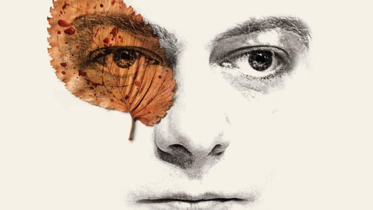
Maks Bereski’s Misericordia (limited, March 21) is perhaps less crazy, but still captivating in its merging of man and nature. It’s another puzzle to solve insofar as who this man is and what the (blood-splashed) leaf represents, but (unlike The Heirloom) we don’t really have anywhere to jump off from as far as figuring out the inherent psychology.
Reading the synopsis doesn’t help, either––at least not beyond the discovery of a murder for that blood. If anything, reading it confuses us even more: there’s so much going on that this minimalist image proves even more indecipherable by not blatantly using any of those events.
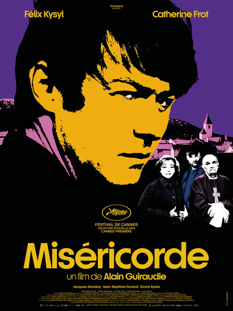
We must take it on face value instead. Appreciate its balance and symmetry. The juxtaposition of its playful sans serif and rigid typography. The shapes that come out of its color palette leading our eyes down the page in a giant “I” pattern to maintain focus on this face filtered through the eye-patch brutality of man’s nature.
It’s a stark shift from Misericordia‘s heavily filtered French counterpart. Same font and rigid typography, but the coloring becomes more oppressive in its lack of white. The dynamic between warm and cool hues also creates separation via importance and / or morality. The title does mean “mercy,” after all. Mercy for whom, though? The killer or the killed?
Pairs


I can’t quite shake a feeling of dread when looking at the French poster for Who by Fire (limited, March 14). There’s little going on––two people sitting very close with legs and arms touching––but it’s difficult not to read into the scene as some sort of calm before the storm. Will their hands touch? Is there a shared sense of longing? Is it a power dynamic wherein trust is about to be broken?
By cropping things so both of their faces fall out of frame, we have no expressions with which to infer upon intent. Maybe they are completely unaware of their proximity. Or maybe he’s staring directly at her while she looks offscreen. It’s the kind of seemingly innocuous image that would only be used in such a prominent way if something more was happening. We must thus assume it is.
Regardless, the poster is clean and effective in its formal simplicity. Large photo with textured grain framed so all the text beyond the title can live on a separate island of its own. The title is stacked and centered to bring our eyes down to those hands and the inference of motion. I really like the font selection, too, its idiosyncratic look consisting of sharply indented curves and extremely thin spacing within each letter as well as the kerning between them.
The comic book-esque layout for We’re All Gonna Die (limited, March 7) is conversely very direct in its content and context by presenting multiple scenes we can infer take place during the film’s plot. A couple driving. A plane crashing. A car sinking. A dead fly either smoking upwards or a casualty of a fast descent downwards.
What’s cool about the design is that each of those aspects exist in tandem by way of the windows created from the title being rendered as knockout letters. Starting at the bottom “Die” we see the car roof fading to reveal a sky that transitions into the water and horizon line within the “Gonna” as the aforementioned plane doubles as the counter of the “o.” Then the sky from that section transitions back into the water holding the drowning car within the “All” as the “We’re” connects with it to form one continuous block to house the remainder of its trees’ branches.
I do think the plume of smoke at the center takes something away from the illustration, but I’ll give the artists the benefit of the doubt as far as its meaning to the film itself. And for those too slow to realize the imagery is the title, it’s duplicated at the bottom just in case.
If we started with implied camaraderie and moved to obvious camaraderie, it only makes sense we should finish with undeniable connection via Viêt and Nam (limited, March 28). Here the two characters are joined for a kiss (and more), their shoulders and heads peeking through the left side edge as our bird’s-eye vantage sees them laying upon a dark and glinting surface dirtying their flesh.
Its frame draws away from the edges to give an old-timey photographic border that allows it to fade, warp, and absorb into the white, as though ink moistened by water. The effect gives the whole a duality of past and present––static snap and window onto current action. And by using the angle of their bodies to split the page, designers can fill the gaps in a way that ensures nothing distracts from that kiss. Festival laurels at the end of a hand. Title stacked at the end of a platform of text to mimic the incline of their bodies. Each piece is sized and measured to perfection.
Ensemble


Pedro Bernstein’s poster for You Burn Me (limited, March 7) is like a treasure map. Creased fold. Burnt edge. Faded words rubbed off or disappeared. Hand-painted topographic elements. Here is the place where a poet and nymph meet after being submerged in water.
The text doesn’t feel as real as the watercolor (it’s uniform fidelity and opaqueness scream “digitally superimposed”), but it is still man-made to maintain the uniqueness of the whole as a contrast to its glossy counterparts. I love that this human touch is apparent throughout––even on the logos by way of rough outlines to ensure their machine-like presence doesn’t seem so out-of-place. The decision to put the cast names beneath their figures is nice, too: it lends the work a child-like genesis wherein a young artist tells their viewers where everyone is on the board.
The layers of color washes really do it for me, though. Whether smudges from the process of drawing what we see or remnants of pictures that have been covered and / or eroded away, the canvas is given a history that moves beyond its present use. It’s a sheet that’s been passed around. A document of an impossible scenario. Imagination made real.
Erik Lund’s composition for Eephus (limited, March 7) also possesses a collection of characters (via Kaila Reed’s photography) with names scrawled next to each. Rather than be a product of the storyteller, however, these signatures lend value to the images via their own hand.
When the whole is constructed with the vintage texture and framing of old baseball cards, it only makes sense to go that one step further to render it into a faux collectible too. Because those aren’t the actors’ names––they’re the names of the characters as if one of Bill Belinda’s kids walked around the diamond to complete the set. Sure, these aren’t professional athletes whose autographs possess any resale prospects, but that’s not the point. It’s about showing how the game transcends celebrity. Their love and respect for the sport earns our love and respect in return.
I like the picture format with black-lined circles and full body masks, but it’s the title treatment in the pennant and “est. 2025” layout that really won me over. It harkens back to an era of trading cards that we just don’t see since Upper Deck ushered in their photo-centric designs and artifacts. I think I have a binder of 1980s or 1990s Topps cards in my basement that look just like this. That sense of nostalgia goes a long way.
While there may only be two actors on Irene Lee’s MUBI LAB poster for Grand Tour (limited, March 28), their repetition makes it seem like we’re viewing a larger ensemble. This is especially true considering the chalk-lined waves allow for each of their portraits to exist on a separate plane. We’re seeing six disparate moments––three from each––that are unbeholden to the others. Rain-soaked depression, luggage-bound retreat, shoe-tying intrigue.
It’s a chase, a would-be wife hunting down her cold-footed groom. There’s disguise, mystery, and adventure, a staccato melody of checkpoints and close calls driven by the waves of water (or wind) propelling them forward. That the title is broken up into its letters, bouncing around the same tumultuous path, only augments the playfulness while providing steppingstones on which to jump and travel to the next destination.


You lose that sense of fun in Goodlab’s international counterparts. They do a great job complementing its film-still composition with a passport-like typography and crumpled paper flavor in the first, but we lose the chase. The other omits all personality by going generic with its straight, all-caps sans serif text and Photoshopped characters framing the original image. Neither is bad; they simply lack the creativity and motion of Lee’s American release. The contrast shows how important a studio’s allowance for creativity is compared to a more conservative mandate for the status quo.
The post Posterized March 2025: Grand Tour, Eephus, Misericordia & More first appeared on The Film Stage.