


Infographic: “World As 100 People Over The Last Two Centuries”
This is an amazing infographic from Our World In Data. If you go to their site, though, it gets even better – each of those individual charts are interactive, and they have narrative descriptions, too! Plus, you can see a much bigger version of this chart and the others. I’m adding this info to […]
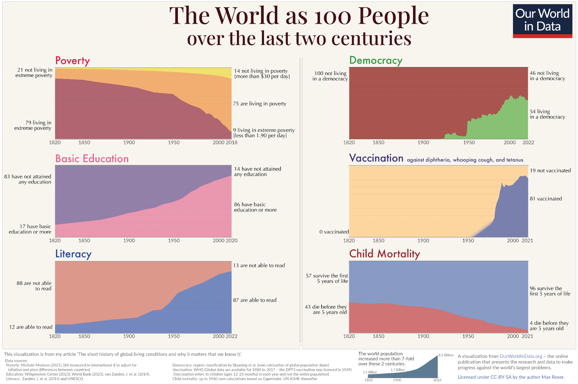
This is an amazing infographic from Our World In Data.
If you go to their site, though, it gets even better – each of those individual charts are interactive, and they have narrative descriptions, too!
Plus, you can see a much bigger version of this chart and the others.
I’m adding this info to The Best Sites That Show Statistics By Reducing The World & The U.S. To 100 People.