


![[FR] MapData App (un terrain de jeu full-stack)](https://media2.dev.to/dynamic/image/width%3D1000,height%3D500,fit%3Dcover,gravity%3Dauto,format%3Dauto/https:%2F%2Fdev-to-uploads.s3.amazonaws.com%2Fuploads%2Farticles%2Fc9f5opayaz1gzmouzb4m.png)


How to Extract YouTube Analytics Data and Analyze in Python
If you’re a YouTube content creator, you’ll make data-driven decisions when posting content. This helps you target the right audience when creating your videos. YouTube Studio provides YouTube Analytics, where you can get comprehensive data about you...

If you’re a YouTube content creator, you’ll make data-driven decisions when posting content. This helps you target the right audience when creating your videos.
YouTube Studio provides YouTube Analytics, where you can get comprehensive data about your channel. But there is a caveat: most of the statistics provided by YouTube Analytics are descriptive and not predictive. This means information like future views, subscriber counts, and factors influencing watch time or earnings are unavailable. This means you’ll need to calculate these metrics yourself.
In this article, you’ll learn how to export data from YouTube Analytics to Python so you can analyze it further or create visualizations. You can even build your own custom dashboard using various Python libraries like Streamlit, Shiny, or Dash.
Here’s what we
Prerequisites
Active YouTube and YouTube Studio Account
Jupyter Notebook, Google Colab, Kaggle, or any other environment that supports Python
Pandas library installed
Seaborn library installed
Matplotlib library installed
Step 1: Identify the Problem Statement
Before proceeding, we need to know what we’re looking for – because YouTube Analytics has many metrics, and this can get overwhelming. My channel doesn’t have a ton of subscribers, but I have quite a few videos and views. So we’ll use my data as an example.
Just note that this analysis I’ll conduct in this tutorial is specific to my channel and can vary from channel to channel. You’ll be able to use the techniques here to answer the same/similar questions using your data, but your results will be different from mine.
Here are the questions I would like to find an answer for:
- Correlation Analysis
Views and watch time – Are longer watch times associated with higher views?
Views and subscribers – Do more views translate to more subscribers?
Impressions and Click-Through Rate (CTR%) – Does a stronger impression lead to better engagement?
Watch time and average view duration – Are longer videos watched more?
- Audience Retention Analysis
Average view duration vs. Video length – Are longer videos watched in full?
Drop-off points – Which duration range has the best retention?
Retention Rate (%) – Watch time divided by duration?
Step 2: Extract the Data
Sign in to your YouTube Studio account, go to the Analytics tab, and click Advanced mode.
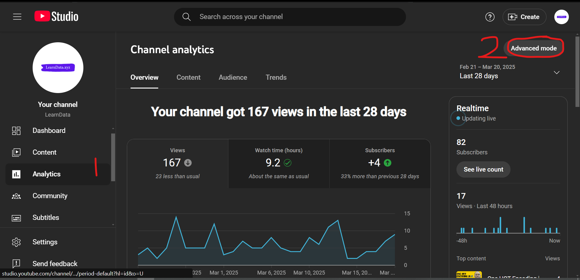
This will open a dashboard showing comprehensive descriptive analytics of your YouTube channel. This can get overwhelming, as there are a lot of metrics and filters with various types of data. This is why I emphasized the importance of knowing your problem and identifying your questions before diving in.
You can select the range of data you are interested in using the date dropdown (1 in the image below) and the Compare to button (2) to compare data from different date ranges.
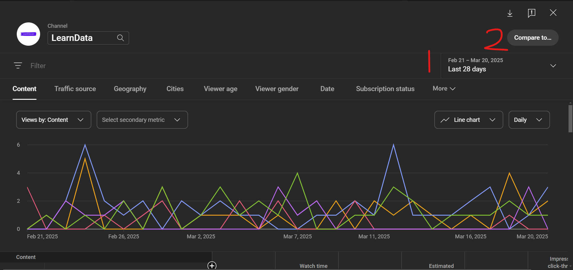
The column headers you see in the dashboard are the filters. Each contains different metrics, and you can find some metrics in one or more filters. You can play around with the tabs and dropdowns to understand them better.
This is just a foundation for understanding your YouTube channel performance. If you have a long-running channel with a large number of subscribers and views, trust me – you can get a lot of insights from your data.
For this tutorial, I will select my entire lifetime data (1) and click the download button at the top right-hand corner (2).
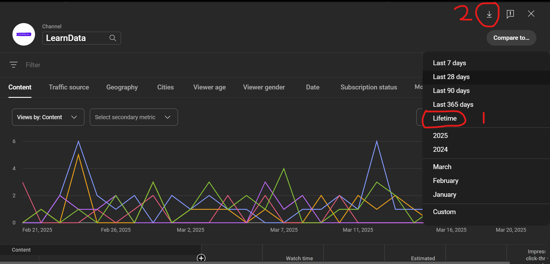
This will display two options: whether to open the data in Google Sheets in a new tab or download the CSV file.
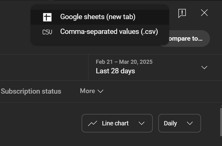
Since we want to use the data in Python, select the option to download the CSV file. After downloading the file, extract the files from the zip folder, and inside the extracted folder, you will see three CSV files: Chart data.csv, Table data.csv, and Totals.csv.
For this tutorial, we are interested in the Table data.csv. Click the data to open and view it in Excel to do some manual data cleaning before importing the data in Python.
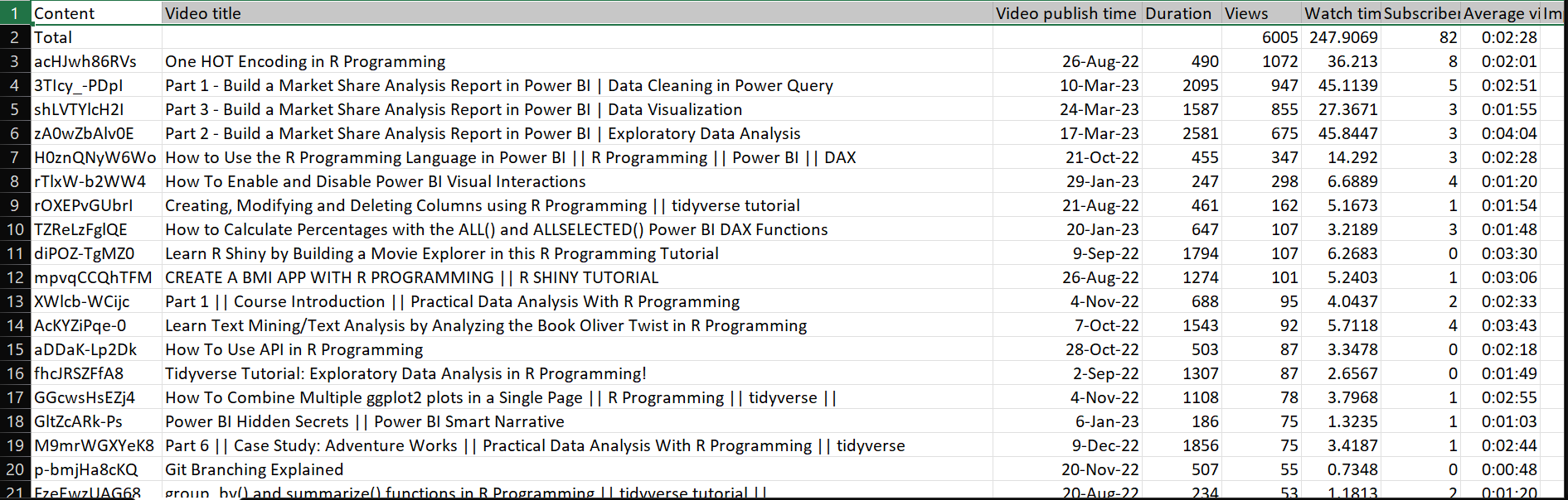
The data is a list of all the videos on my YouTube channel, which is forty (yours might have more or fewer). Remove the first row, which is the Total row, and save the changes.
Here are the columns in the dataset:
Content: The video idVideo title: The video titleVideo publish time: The day the video was publishedDuration: The video duration in secondsViews: The number of views per videoWatch time: The estimated amount of video watch time by your audience in hoursSubscribers: Change in total subscribers found by subtracting subscribers lost from subscribers gained for the selected date and region.Average view duration: Estimated average minutes watched per video.Impressions: Number of times your videos were shown to viewers.Impressions click-through rate (%): Number of times viewers clicked your video after seeing an impression.
Step 3: Analyze the Data in Python
Go to your Jupyter Notebook and import the Pandas, Seaborn, and Matplotlib libraries.
import pandas as pd
import seaborn as sns
import matplotlib.pyplot as plt
Next, import the Table data.csv file.
# Load data
df = pd.read_csv("/content/Table data.csv")
Correlation Analysis
Concerning our problem statement, we are going to plot a correlation heatmap between the following variables: Views, Watch time (hours), Subscribers, Average view duration, and Impressions-click-through rate (%) to see the strength and direction of the relationship between them.
# Convert "Average view duration" (formatted as H:M:S) to seconds
df['Average view duration'] = pd.to_timedelta(df['Average view duration']).dt.total_seconds()

# Select relevant columns for correlation analysis
correlation_data = df[['Views', 'Watch time (hours)', 'Subscribers', 'Average view duration', 'Impressions', 'Impressions click-through rate (%)']]

# Compute correlation matrix
corr_matrix = correlation_data.corr()

# Visualization using a heatmap
plt.figure(figsize=(10, 6))
sns.heatmap(corr_matrix, annot=True, cmap='coolwarm', fmt=".2f", linewidths=0.5)
plt.title("YouTube Analytics Correlation Heatmap")
plt.show()
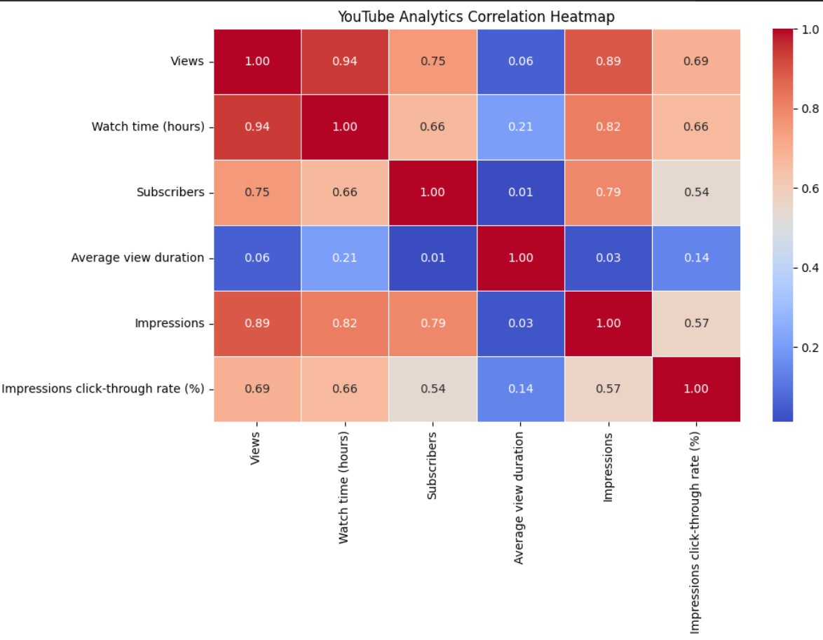
Correlation coefficient ranges from -1 to 1, where values less than 0 mean a negative relationship, while those above 0 mean a positive relationship. The lower the value in a negative relationship, the stronger the negative relationship, while the higher the value in a positive relationship, the stronger the relationship.
Based on the plot above, here are the key insights:
Views and watch time: There's a strong correlation (0.94) between views and watch time, suggesting that as videos get more views, they also accumulate more watch hours, proportionally.
Views and impressions: There's a strong correlation (0.89) between views and impressions, indicating that videos that are shown more frequently in recommendations and search results tend to get more views.
Average view duration: This metric has very weak correlations with almost all other metrics. It is particularly notable in views (0.06), subscribers (0.01), and impressions (0.03).
Subscribers and metrics: Subscribers have a moderate to strong correlation with views (0.75) and impressions (0.79) and a weaker correlation with click-through rate (0.54).
Click-through rate: Has moderate correlations with views (0.69) and watch time (0.66) but a weaker correlation with subscribers (0.54).
The most significant insight is that average view duration appears to operate independently from other metrics. This suggests that on my YouTube channel, a video's ability to retain viewers throughout its length isn't necessarily connected to how many people watch it, how often it's recommended, or how many subscribers the channel has.
This implies that the strategies I would implement to increase my views, subscribers, and impressions might differ from those needed to improve average view duration, an important factor in YouTube's recommendation algorithm. This means I need to look at other YouTube metrics that have a relationship with average view duration, which is a topic for another article.
Audience Retention Analysis
To analyze audience retention, we need to create a new variable Retention Rate (%), which is calculated by dividing a video’s Average view duration by the Duration and expressing it as a percentage.
# Calculate retention rate as (Average View Duration / Total Video Duration) * 100
df['Retention Rate (%)'] = (df['Average view duration'] / df['Duration']) * 100
Next is to sort the videos in ascending order based on Retention Rate (%) and display the top 10 videos with the highest retention rate.
# Sort videos by retention rate
df_sorted = df.sort_values(by='Retention Rate (%)', ascending=False)

# Display top 10 videos with highest retention
df_sorted[['Video title', 'Duration', 'Average view duration', 'Retention Rate (%)']].head(10)
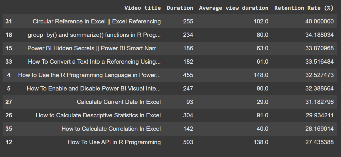
From the table above, you will notice that most of the videos in the top 10 spot are not above 503 seconds, which is approximately 8 minutes. This implies that my audience are interested in short, mid-range videos.
Most videos with the high retention rate have a duration less than 4 minutes, with a retention rate ranging from 27% - 40%. With this insight, I can ensure that the next videos I will upload are within 5 to 8 minutes.
Let’s take a look at the bottom 10 videos with a low retention rate:
# Sort videos by retention rate
df_sorted = df.sort_values(by='Retention Rate (%)', ascending=False)

# Display bottom 10 videos with highest retention
df_sorted[['Video title', 'Duration', 'Average view duration', 'Retention Rate (%)']].tail(10)
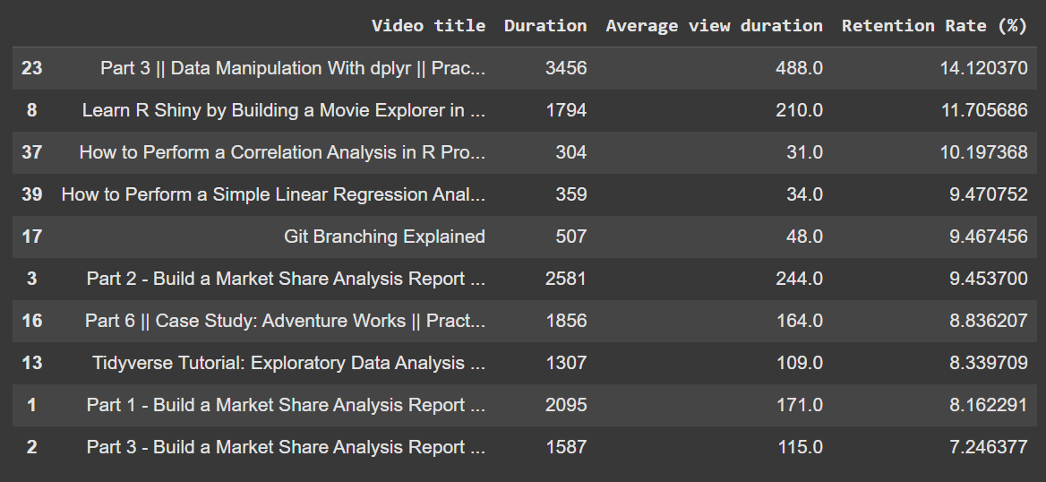
From the above information, you will notice that long videos in my channel spanning approximately 22 - 58 minutes have a low retention rate. This further supports the claim above that my audience is more interested in shorter videos.
We can further decide to plot a scattered plot of Duration against Retention Rate (%) to summarize the above tables.
# Set style for plots
sns.set_style("whitegrid")

# Plot Retention Rate vs. Video Duration
plt.figure(figsize=(12, 6))

sns.scatterplot(data=df, x='Duration', y='Retention Rate (%)', hue='Views', size='Views', sizes=(20, 200), palette='coolwarm')
plt.title("Audience Retention vs. Video Duration")
plt.xlabel("Video Duration (seconds)")
plt.ylabel("Retention Rate (%)")
plt.legend(title="Views", loc="upper right")

plt.show()

The scatter plot above shows the relationship between audience retention rate (y-axis, measured as a percentage) and video duration (x-axis, measured in seconds) for various videos. Here are the following key observations:
There's a clear negative correlation between video duration and retention rate – as videos get longer, the retention rate generally decreases.
The highest retention rates (35-40%) are found in shorter videos, mostly under 500 seconds (around 8 minutes).
Videos over 1500 seconds (25 minutes) consistently show retention rates below 15%.
The size and color of the dots represent the number of views, with larger, redder dots indicating more views (up to 1000) and smaller, blue dots representing fewer views (around 200).
Interestingly, some mid-length videos (around 500 seconds) have both higher view counts (indicated by larger red dots) and decent retention rates of about 25%.
The longest video in the dataset (at around 3500 seconds or 58 minutes) has a retention rate of about 14% and relatively few views.
This plot further confirms the claim that shorter videos tend to better maintain audience attention on my channel, though some mid-length videos can still perform well in terms of both retention and view count.
Conclusion
What we’ve learned from my data is just the tip of the iceberg. YouTube has many metrics, and because my channel is not monetized and has few subscribers and videos, I don’t have data on monetization, demographics, and other metrics.
But after reading this article, I hope that you can think of endless information you want to get based on these metrics. You can even forecast your views, subscriber counts, and revenue for the next days or months. You can also perform a multivariate time series analysis to see how these factors affect your primary variable of interest.
If you find this article interesting, don’t forget to check out my blog for other interesting articles, follow me on Medium, connect on LinkedIn, and subscribe to my YouTube channel.