


How to Create Themes (light/dark) with Styled-components
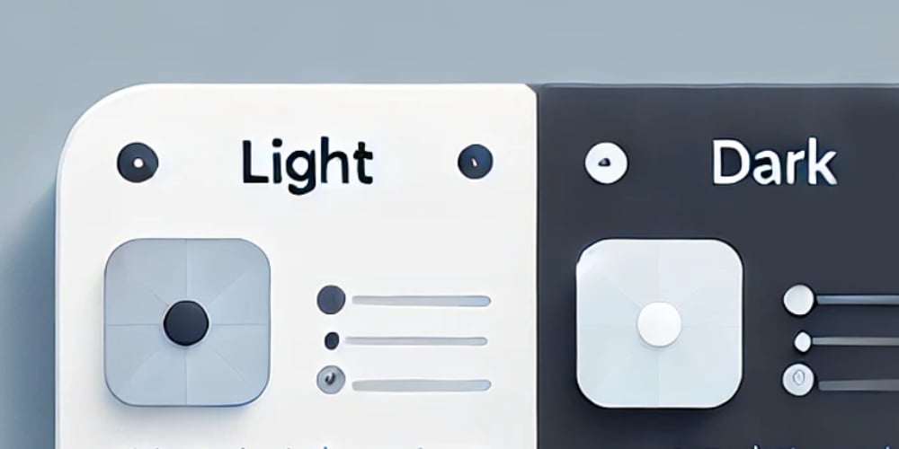
Creating a dark/light theme toggle is a great way to improve user experience — and it’s simpler than it looks, especially when using styled-components. Today, I'll show you a quick and practical way to set up a theme system in React + styled-components, including how to dynamically switch between themes. ✅ The Problem: Multiple color schemes, but maintainable When building components, it's common to need different color schemes (like light and dark mode). Instead of hardcoding colors everywhere, how can we define and reuse them in a clean and flexible way?
Creating a dark/light theme toggle is a great way to improve user experience — and it’s simpler than it looks, especially when using styled-components.
Today, I'll show you a quick and practical way to set up a theme system in React + styled-components, including how to dynamically switch between themes.
✅ The Problem: Multiple color schemes, but maintainable
When building components, it's common to need different color schemes (like light and dark mode).
Instead of hardcoding colors everywhere, how can we define and reuse them in a clean and flexible way?