


Google design team reveals why it changed YouTube’s color from red to… red
YouTube’s red got cooler a few months ago — literally. The platform updated its color and added a gradient. Here's why.
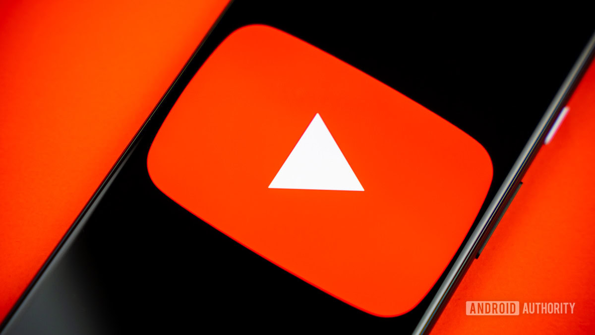
Credit: Edgar Cervantes / Android Authority
- YouTube updated its signature red to a cooler shade and introduced a red-to-magenta gradient, aiming for a fresher and more dynamic look.
- The change fixes issues with the old red, which appeared too harsh, caused screen burn-in, and looked orange on some displays.
- Accessibility and usability were also key factors in the design team’s thinking.
If you’ve noticed something a little different about YouTube lately but couldn’t quite put your finger on it, you’re not alone. The platform quietly tweaked its iconic red in the last few months, shifting to a cooler shade and introducing a red-magenta gradient in key elements like the progress bar.
The change was subtle, but YouTube’s design team took it very seriously. In a deep dive into the decision-making process, they explained how this seemingly minor color adjustment was the result of extensive research, accessibility considerations, and technical factors.