


Advanced Jetpack Compose Previews
Jetpack Compose provides powerful tools to preview UI components without running the app on a device or emulator. The @Preview annotation is a key feature that enables developers to visualize their UI in different configurations. By using decorators (parameters), such as uiMode, fontScaleand more, you can quickly test your UI under various conditions. For this tutorial, let's consider the following data class and a list of data entries: data class StarWarsMovie( val title: String, val releaseYear: String, val imageRes: Int ) val movies = listOf( StarWarsMovie("A New Hope", "1977", R.drawable.a_new_hope), StarWarsMovie("The Empire Strikes Back", "1980", R.drawable.empire_strikes_back), StarWarsMovie("Return of the Jedi", "1983", R.drawable.return_of_the_jedi), StarWarsMovie("The Phantom Menace", "1999", R.drawable.phantom_menace), StarWarsMovie("Attack of the Clones", "2002", R.drawable.attack_of_the_clones), StarWarsMovie("Revenge of the Sith", "2005", R.drawable.revenge_of_the_sith), StarWarsMovie("The Force Awakens", "2015", R.drawable.force_awakens), StarWarsMovie("The Last Jedi", "2017", R.drawable.last_jedi), StarWarsMovie("The Rise of Skywalker", "2019", R.drawable.rise_of_skywalker) ) Basic Usage of @Preview The @Preview annotation is used in Jetpack Compose to render a Composable function inside the Android Studio preview window. A basic example looks like this: @Preview @Composable fun StarWarsMoviePreview() { StarWarsMovieCard(movie = movies[1]) } This will render a simple list entry for a Star Wars movie in the default light mode, default font size, and a standard device configuration. Preview Parameters (Decorators) Jetpack Compose allows you to customize previews using additional parameters in the @Preview annotation. These parameters make it easier to test different UI states without manually changing device settings. 1. Dark Mode Preview To preview your UI in dark mode, use the uiMode parameter and wrap the component inside your theme: @Preview(name = "Night mode", uiMode = UI_MODE_NIGHT_YES, showBackground = true) @Composable fun StarWarsMovieDarkModePreview() { AdvancedComposePreviewsTheme { Box(modifier = Modifier.padding(8.dp)) { StarWarsMovieCard(movie = movies[2]) } } } Also note the name parameter, this allows you to set a title above the preview: 2. Font Scale Preview To test how your UI adapts to different font scales (for accessibility testing), use fontScale: @Preview(name = "Large font", fontScale = 1.5f) @Composable fun StarWarsMovieLargeFontPreview() { StarWarsMovieCard(movie = movies[3]) } This is useful to ensure text elements are not cut off and layouts adjust properly when the user increases text size in system settings. 3. Multiple Device Previews You can specify different devices for testing: @Preview(device = Devices.PIXEL_4) @Preview(device = Devices.NEXUS_7) @Composable fun StarWarsMovieMultipleDevicesPreview() { StarWarsMovieCard(movie = movies[4]) } This ensures that your UI is responsive across various screen sizes. 4. Custom Background Color To set a background color for better visibility in previews, use backgroundColor: @Preview(backgroundColor = 0xFFFF0000, showBackground = true) @Composable fun StarWarsMovieWithBackgroundPreview() { Box(modifier = Modifier.padding(8.dp)) { StarWarsMovieCard(movie = movies[5]) } } The backgroundColor parameter in the @Preview annotation accepts a hexadecimal ARGB color value — specifically, a Long formatted as 0xAARRGGBB: 5. Show System UI Elements You can enable showing system UI elements, such as status bars and navigation bars, using showSystemUi: @Preview(showSystemUi = true) @Composable fun StarWarsMovieWithSystemUIPreview() { StarWarsMovieList(modifier = Modifier.padding(top = 40.dp)) } Testing Edge Cases If you have conditional view presentation logic in your compose code, it is a good idea to have some previews with those cases to ensure nothing breaks when you make changes. Consider the following card that presents the Star Wars movie using a ConstraintLayout: @Composable fun StarWarsMovieCardWithConditions(movie: StarWarsMovie) { Card( modifier = Modifier .fillMaxWidth(), elevation = CardDefaults.cardElevation(defaultElevation = 4.dp), colors = CardDefaults.cardColors(containerColor = MaterialTheme.colorScheme.surfaceContainer) ) { ConstraintLayout( modifier = Modifier .fillMaxWidth() ) { val (image, titleAndCount, chevron) = createRefs() Image( modifier = Modifier .constrainAs(image) { start.linkTo(parent.start) top.linkTo(parent.top

Jetpack Compose provides powerful tools to preview UI components without running the app on a device or emulator. The @Preview annotation is a key feature that enables developers to visualize their UI in different configurations. By using decorators (parameters), such as uiMode, fontScaleand more, you can quickly test your UI under various conditions.
For this tutorial, let's consider the following data class and a list of data entries:
data class StarWarsMovie(
    val title: String,
    val releaseYear: String,
    val imageRes: Int
)
val movies = listOf(
StarWarsMovie("A New Hope", "1977", R.drawable.a_new_hope),
StarWarsMovie("The Empire Strikes Back", "1980", R.drawable.empire_strikes_back),
StarWarsMovie("Return of the Jedi", "1983", R.drawable.return_of_the_jedi),
StarWarsMovie("The Phantom Menace", "1999", R.drawable.phantom_menace),
StarWarsMovie("Attack of the Clones", "2002", R.drawable.attack_of_the_clones),
StarWarsMovie("Revenge of the Sith", "2005", R.drawable.revenge_of_the_sith),
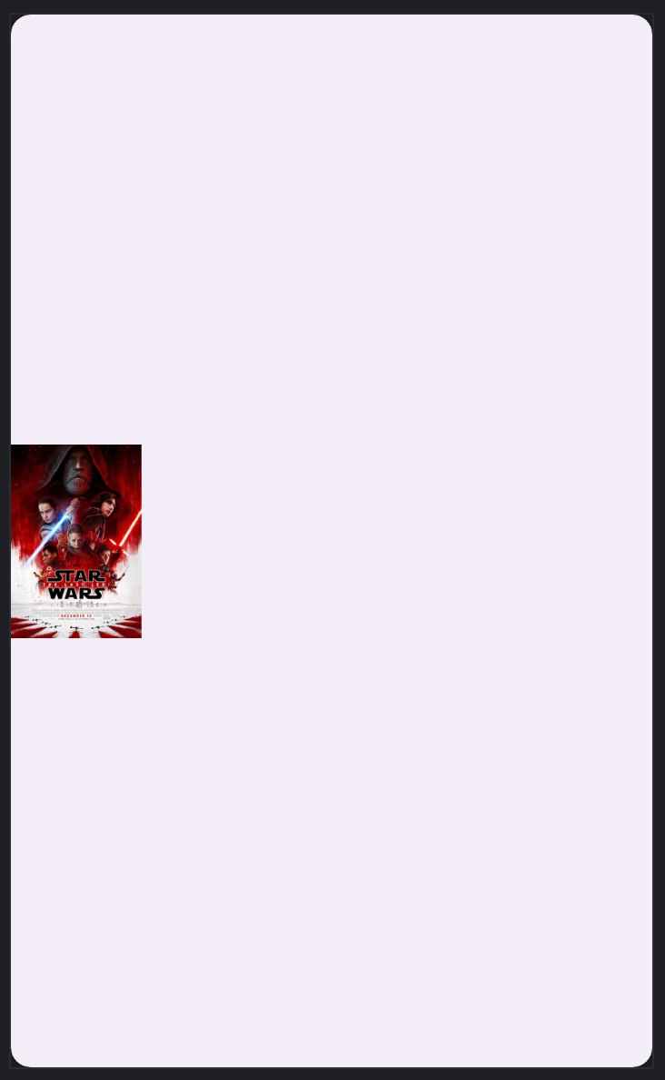
StarWarsMovie("The Force Awakens", "2015", R.drawable.force_awakens),
StarWarsMovie("The Last Jedi", "2017", R.drawable.last_jedi),
StarWarsMovie("The Rise of Skywalker", "2019", R.drawable.rise_of_skywalker)
)
Basic Usage of @Preview
The @Preview annotation is used in Jetpack Compose to render a Composable function inside the Android Studio preview window. A basic example looks like this:
@Preview
@Composable
fun StarWarsMoviePreview() {
    StarWarsMovieCard(movie = movies[1])
}
This will render a simple list entry for a Star Wars movie in the default light mode, default font size, and a standard device configuration.
Preview Parameters (Decorators)
Jetpack Compose allows you to customize previews using additional parameters in the @Preview annotation. These parameters make it easier to test different UI states without manually changing device settings.
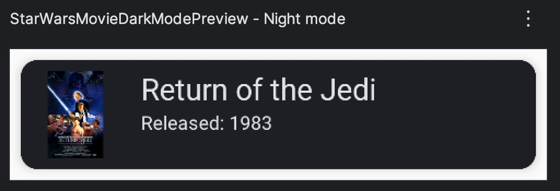
1. Dark Mode Preview
To preview your UI in dark mode, use the uiMode parameter and wrap the component inside your theme:
@Preview(name = "Night mode", uiMode = UI_MODE_NIGHT_YES, showBackground = true)
@Composable
fun StarWarsMovieDarkModePreview() {
    AdvancedComposePreviewsTheme {
        Box(modifier = Modifier.padding(8.dp)) {
            StarWarsMovieCard(movie = movies[2])
        }
    }
}
Also note the name parameter, this allows you to set a title above the preview:
2. Font Scale Preview
To test how your UI adapts to different font scales (for accessibility testing), use fontScale:
@Preview(name = "Large font", fontScale = 1.5f)
@Composable
fun StarWarsMovieLargeFontPreview() {
    StarWarsMovieCard(movie = movies[3])
}
This is useful to ensure text elements are not cut off and layouts adjust properly when the user increases text size in system settings.

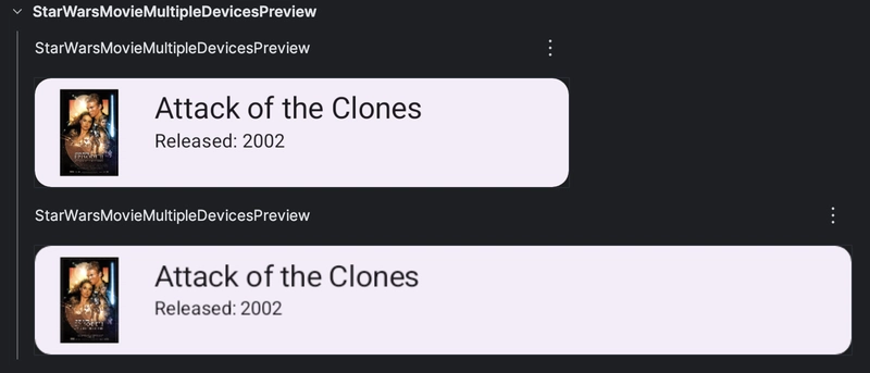
3. Multiple Device Previews
You can specify different devices for testing:
@Preview(device = Devices.PIXEL_4)
@Preview(device = Devices.NEXUS_7)
@Composable
fun StarWarsMovieMultipleDevicesPreview() {
    StarWarsMovieCard(movie = movies[4])
}
This ensures that your UI is responsive across various screen sizes.
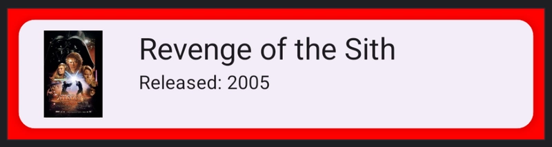
4. Custom Background Color
To set a background color for better visibility in previews, use backgroundColor:
@Preview(backgroundColor = 0xFFFF0000, showBackground = true)
@Composable
fun StarWarsMovieWithBackgroundPreview() {
    Box(modifier = Modifier.padding(8.dp)) {
        StarWarsMovieCard(movie = movies[5])
    }
}
The backgroundColor parameter in the @Preview annotation accepts a hexadecimal ARGB color value — specifically, a Long formatted as 0xAARRGGBB:
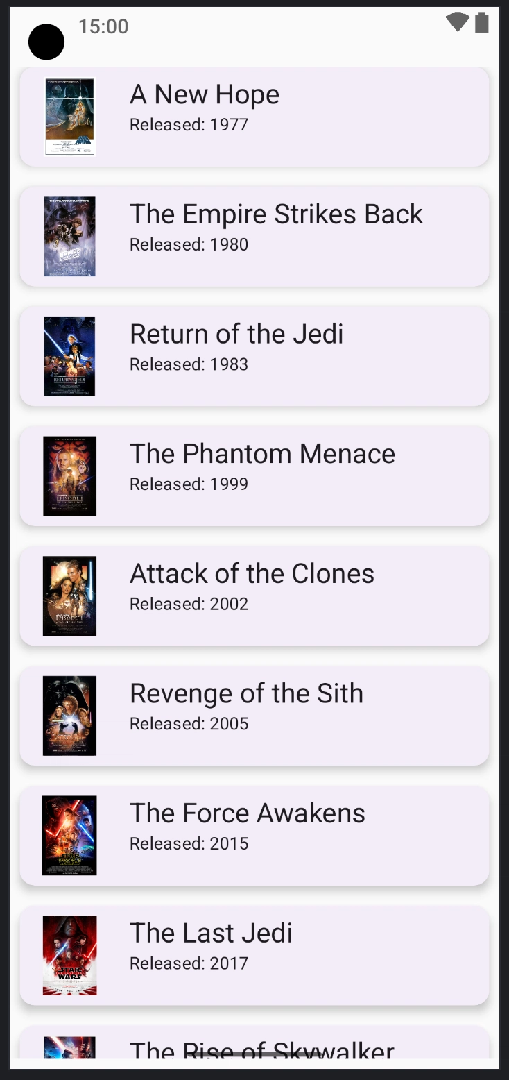
5. Show System UI Elements
You can enable showing system UI elements, such as status bars and navigation bars, using showSystemUi:
@Preview(showSystemUi = true)
@Composable
fun StarWarsMovieWithSystemUIPreview() {
    StarWarsMovieList(modifier = Modifier.padding(top = 40.dp))
}
Testing Edge Cases
If you have conditional view presentation logic in your compose code, it is a good idea to have some previews with those cases to ensure nothing breaks when you make changes.
Consider the following card that presents the Star Wars movie using a ConstraintLayout:
@Composable
fun StarWarsMovieCardWithConditions(movie: StarWarsMovie) {
    Card(
        modifier = Modifier
            .fillMaxWidth(),
        elevation = CardDefaults.cardElevation(defaultElevation = 4.dp),
        colors = CardDefaults.cardColors(containerColor = MaterialTheme.colorScheme.surfaceContainer)
    ) {
        ConstraintLayout(
            modifier = Modifier
                .fillMaxWidth()
        ) {
            val (image, titleAndCount, chevron) = createRefs()
            Image(
                modifier = Modifier
                    .constrainAs(image) {
                        start.linkTo(parent.start)
                        top.linkTo(parent.top)
                        bottom.linkTo(parent.bottom)
                    },
                painter = painterResource(id = movie.imageRes),
                contentDescription = "${movie.title} Poster",
            )
            Column(
                modifier = Modifier
                    .constrainAs(titleAndCount) {
                        top.linkTo(parent.top)
                        start.linkTo(image.end)
                        bottom.linkTo(parent.bottom)
                        // Notice the issue here, if the chevron is not present the view breaks
                        end.linkTo(chevron.start)
                        width = Dimension.fillToConstraints
                    },
            ) {
                Text(text = movie.title, style = MaterialTheme.typography.titleLarge)
                Text(
                    text = "Released: ${movie.releaseYear}",
                    style = MaterialTheme.typography.bodyMedium
                )
            }
            if (movie.title.contains("Force")) {
                Image(
                    imageVector = Icons.AutoMirrored.Filled.KeyboardArrowRight,
                    modifier = Modifier
                        .constrainAs(chevron) {
                            end.linkTo(parent.end)
                            top.linkTo(parent.top)
                            bottom.linkTo(parent.bottom)
                        },
                    alignment = Alignment.CenterEnd,
                    contentDescription = null
                )
            }
        }
    }
}
The part:
end.linkTo(chevron.start)
Could be problematic because the chevron is not always rendered. In cases where the chevron is present, everything works well:
@Preview
@Composable
fun StarWarsMovieCardWithConditionsPreview() {
    StarWarsMovieCardWithConditions(movie = movies[6])
}
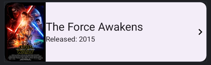
But in cases where the chevron is not rendered our view will be broken:
@Preview
@Composable
fun StarWarsMovieCardWithConditionsFailPreview() {
    StarWarsMovieCardWithConditions(movie = movies[7])
}
By having previews that cover all conditional cases, we can catch this bug very quickly.
For the full project please check out the github repo