


鸿蒙Next开发实战教程-注册登录页面
今天要和大家分享的是使用鸿蒙开发一个注册登录页面,效果如图: 这个页面布局比较简单,非常适合新手友友们学习。大体上就是一个层叠布局,背景图片在下,内容部分在上,基础结构代码如下: Stack(){ //背景图片 Image($r('app.media.back_icon')) .width('100%') .height('100%') Column(){ //内容部分 } .width('100%') .height('100%') .alignItems(HorizontalAlign.Start) .padding({left:30,right:30,top:140}) } .width('100%') .height('100%') 内容部分也比较简单,基本都是输入框和文字的纵向排列,有必要说一嘴的地方是验证码输入框我采用输入框组件和文本组件的组合方式来实现: Row(){ TextInput({placeholder:'请输入验证码'}) .placeholderColor('#8F959E') .fontSize(15) .fontColor(Color.Black) .width('70%') .height(50) .backgroundColor(Color.White) Row(){ } .width(1) .height(30) .backgroundColor('rgba(216, 216, 216, 1)') .borderRadius(0.5) Text('获取验证码') .width('30%') .height(50) .fontColor('rgba(20, 86, 240, 1)') .fontSize(15) .textAlign(TextAlign.Center) } .width('100%') .height(50) .borderRadius(10) .borderWidth(1) .borderColor('#D0D3D5') .backgroundColor(Color.White) .margin({top:25}) 在密码输入框中,只要设置TextInput的类型就可以实现带眼睛logo的密码输入框效果: TextInput({placeholder:'请输入密码'}) .type(InputType.Password) 登录页面和注册页面类似,把获取验证码部分去掉就可以了,完整代码如下: import { Font, router } from '@kit.ArkUI'; @Entry @Component struct Index { @State message: string = 'Hello World'; build() { Stack(){ Image($r('app.media.back_icon')) .width('100%') .height('100%') Column(){ Row(){ Image($r('app.media.logo')) .width(33) .height(33) Text('幽蓝计划') .fontSize(27) .fontColor(Color.Black) .fontWeight(FontWeight.Bolder) .margin({left:10}) } Text('注册账号') .fontSize(18) .fontColor('rgba(100, 106, 115, 1)') .margin({top:8}) TextInput({placeholder:'请输入账号'}) .placeholderColor('#8F959E') .fontSize(15) .fontColor(Color.Black) .width('100%') .height(50) .borderRadius(10) .borderWidth(1) .borderColor('#D0D3D5') .backgroundColor(Color.White) .margin({top:50}) Row(){ TextInput({placeholder:'请输入验证码'}) .placeholderColor('#8F959E') .fontSize(15) .fontColor(Color.Black) .width('70%') .height(50) .backgroundColor(Color.White) Row(){ } .width(1) .height(30) .backgroundColor('rgba(216, 216, 216, 1)') .borderRadius(0.5) Text('获取验证码') .width('30%') .height(50) .fontColor('rgba(20, 86, 240, 1)') .fontSize(15) .textAlign(TextAlign.Center) } .width('100%') .height(50) .borderRadius(10) .borderWidth(1) .borderColor('#D0D3D5') .backgroundColor(Color.White) .margin({top:25}) TextInput({placeholder:'请输入密码'}) .type(InputType.Password) .enterKeyType(EnterKeyType.Done) .placeholderColor('#8F959E') .fontSize(15) .fontColor(Color.Black) .width('100%') .height(50) .borderRadius(10) .borderWidth(1) .borderColor('#D0D3D5') .backgroundColor(Color.White) .margin({top:25}) Column(){ Text('注册') .width('100%') .height(50) .backgroundColor('rgba(20, 86, 240, 1)') .fontColor(Color.White) .fontSize(15) .textAlign(TextAlign.Center) .borderRadius(10) Row(){ Text("已有账号?") .fontColor('rgba(143, 149, 158, 1)') .fontSize(14) Text("立即登录") .fontColor('rgba(20, 86, 240, 1)') .fontSize(14) .onClick(()=>{ router.back() }) } .margin({top:25}) } .margin({top:75}) .width('100%') .alignItems(HorizontalAlign.Center) } .width('100%') .height('100%') .alignItems(HorizontalAlign.Start) .padding({left:30,right:30,top:140}) } .width('100%') .height('100%') } }
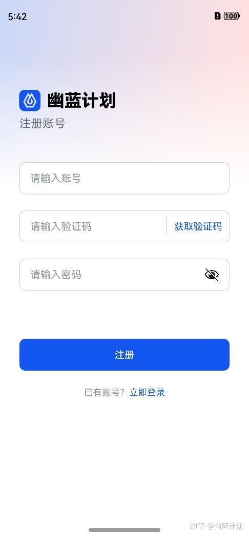
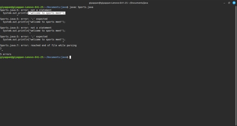
今天要和大家分享的是使用鸿蒙开发一个注册登录页面,效果如图:
这个页面布局比较简单,非常适合新手友友们学习。大体上就是一个层叠布局,背景图片在下,内容部分在上,基础结构代码如下:
Stack(){

      //背景图片

      Image($r('app.media.back_icon'))

        .width('100%')

        .height('100%')


      Column(){

        //内容部分


      }

      .width('100%')

      .height('100%')

      .alignItems(HorizontalAlign.Start)

      .padding({left:30,right:30,top:140})

}

.width('100%')

.height('100%')
内容部分也比较简单,基本都是输入框和文字的纵向排列,有必要说一嘴的地方是验证码输入框我采用输入框组件和文本组件的组合方式来实现:
Row(){

          TextInput({placeholder:'请输入验证码'})

            .placeholderColor('#8F959E')

            .fontSize(15)

            .fontColor(Color.Black)

            .width('70%')

            .height(50)

            .backgroundColor(Color.White)


          Row(){


          }

          .width(1)

          .height(30)

          .backgroundColor('rgba(216, 216, 216, 1)')

          .borderRadius(0.5)


          Text('获取验证码')

            .width('30%')

            .height(50)

            .fontColor('rgba(20, 86, 240, 1)')

            .fontSize(15)

            .textAlign(TextAlign.Center)

        }

        .width('100%')

        .height(50)

        .borderRadius(10)

        .borderWidth(1)

        .borderColor('#D0D3D5')

        .backgroundColor(Color.White)

        .margin({top:25})
在密码输入框中,只要设置TextInput的类型就可以实现带眼睛logo的密码输入框效果:
TextInput({placeholder:'请输入密码'})

          .type(InputType.Password)
登录页面和注册页面类似,把获取验证码部分去掉就可以了,完整代码如下:
import { Font, router } from '@kit.ArkUI';

@Entry

@Component

struct Index {

  @State message: string = 'Hello World';


  build() {

    Stack(){

      Image($r('app.media.back_icon'))

        .width('100%')

        .height('100%')


      Column(){

        Row(){

          Image($r('app.media.logo'))

            .width(33)

            .height(33)

          Text('幽蓝计划')

            .fontSize(27)

            .fontColor(Color.Black)

            .fontWeight(FontWeight.Bolder)

            .margin({left:10})

        }

        Text('注册账号')

          .fontSize(18)

          .fontColor('rgba(100, 106, 115, 1)')

          .margin({top:8})


        TextInput({placeholder:'请输入账号'})

          .placeholderColor('#8F959E')

          .fontSize(15)

          .fontColor(Color.Black)

          .width('100%')

          .height(50)

          .borderRadius(10)

          .borderWidth(1)

          .borderColor('#D0D3D5')

          .backgroundColor(Color.White)

          .margin({top:50})


        Row(){

          TextInput({placeholder:'请输入验证码'})

            .placeholderColor('#8F959E')

            .fontSize(15)

            .fontColor(Color.Black)

            .width('70%')

            .height(50)

            .backgroundColor(Color.White)


          Row(){


          }

          .width(1)

          .height(30)

          .backgroundColor('rgba(216, 216, 216, 1)')

          .borderRadius(0.5)


          Text('获取验证码')

            .width('30%')

            .height(50)

            .fontColor('rgba(20, 86, 240, 1)')

            .fontSize(15)

            .textAlign(TextAlign.Center)

        }

        .width('100%')

        .height(50)

        .borderRadius(10)

        .borderWidth(1)

        .borderColor('#D0D3D5')

        .backgroundColor(Color.White)

        .margin({top:25})


        TextInput({placeholder:'请输入密码'})

          .type(InputType.Password)

          .enterKeyType(EnterKeyType.Done)

          .placeholderColor('#8F959E')

          .fontSize(15)

          .fontColor(Color.Black)

          .width('100%')

          .height(50)

          .borderRadius(10)

          .borderWidth(1)

          .borderColor('#D0D3D5')

          .backgroundColor(Color.White)

          .margin({top:25})


        Column(){

          Text('注册')

            .width('100%')

            .height(50)

            .backgroundColor('rgba(20, 86, 240, 1)')

            .fontColor(Color.White)

            .fontSize(15)

            .textAlign(TextAlign.Center)

            .borderRadius(10)


          Row(){

            Text("已有账号?")

              .fontColor('rgba(143, 149, 158, 1)')

              .fontSize(14)

            Text("立即登录")

              .fontColor('rgba(20, 86, 240, 1)')

              .fontSize(14)

              .onClick(()=>{

                router.back()

              })

          }

          .margin({top:25})

        }

        .margin({top:75})

        .width('100%')

        .alignItems(HorizontalAlign.Center)

      }

      .width('100%')

      .height('100%')

      .alignItems(HorizontalAlign.Start)

      .padding({left:30,right:30,top:140})

    }

    .width('100%')

    .height('100%')

  }

}