


![[DEALS] Microsoft Visual Studio Professional 2022 + The Premium Learn to Code Certification Bundle (97% off) & Other Deals Up To 98% Off](https://www.javacodegeeks.com/wp-content/uploads/2012/12/jcg-logo.jpg)


Theming and Styling in Vaadin – part 2
1. Introduction This article is part of the series: 'Towards Vaadin Developer Certification,' which aims to explain the fundamentals of Vaadin while I study for this certification. The topics covered here are an integral part of the 'Vaadin Developer' Certification. Vaadin offers a variety of customization techniques to enhance the styling of components. These techniques range from simple to complex, providing developers with the flexibility to choose the most suitable method for their needs. 2. Commenting on the Items of the "Styling Scale"(previous article) a. Theme Variants Many Vaadin components allow variations in styling, which we call "Adding Theme Variant." Theme variants are usually represented as Java Enums. Example: button.addThemeVariants(ButtonVariant.LUMO_PRIMARY) b. CSS Variables Using CSS variables is a strategy that allows defining CSS values in global variables, making customization more flexible. Instead of using fixed values, these variables can be reused in various parts of the code. Example of defining and using CSS variables: i. Definition variable: html { --app-background-color: #ffffff; } ii. b.2 Using the variable in CSS properties: button { border: 1px solid var(--app-primary-color); } c. Lumo Variables Lumo is the default theme of Vaadin and is based on CSS properties. It defines the global styling variables that are used as the default for Vaadin. Additionally, these variables can be customized, and the changes will have a global effect on the application. Example of customizing Lumo Variables: html { --lumo-border-radius: 2px; } 3. Customization Scopes in Vaadin Vaadin offers three main scopes for style customization: i. Global: Properties that affect the entire application. ii. Component Type: Global variables applicable to a specific component type. iii. Component Instance: Style definitions specific to a particular instance of a component. 4. Example of customization: i. Instantiation in Java: Button specialButton = new Button("I'm special"); ii. Naming the instance: specialButton.addClassName("special"); iii. Customization via CSS: vaadin-button.special { --lumo-primary-color: cyan; } 5. Conclusion Vaadin's customization techniques provide a robust framework for enhancing the styling of components. By understanding and utilizing these techniques, developers can create visually appealing and functional applications that meet their specific design requirements. Opss. Our conversation is not done yet... See you in the final part of this subject, in our next article about it. • Disclaimer This content is drawn from studies and notes related to the Vaadin 24 certification. For deeper details, please consult the official documentation and learning materials for Vaadin certification. AI tools assisted in the structuring of this content; however, the writing and original content are solely done by the author. Authors Paulo B. A. is an 'Oracle Certified Java Developer' and 'Spring Certified Professional' with a deep passion for Vaadin Flow. He crafts UIs with Vaadin and strives to make it the leading frontend framework for full-stack Java developers worldwide. He loves teaching, sharing knowledge, and creating content. While he enjoys learning theory through certifications, he always advocates for a practical approach. • Linkedin.com/in/pbalves • X.com/p_b_alves • Mastodon.social/@pbalves Staff Writer: Fábio A. P. is a technology enthusiast, self-taught writer, and scholar of society's relationship with technology. Passionate about sharing insights, he provides reliable perspectives on how technology shapes our lives. With clear and precise writing, Fábio simplifies complex topics, empowering readers to navigate the digital age with confidence. • Medium.com/@fabioape

1. Introduction
This article is part of the series: 'Towards Vaadin Developer Certification,' which aims to explain the fundamentals of Vaadin while I study for this certification. The topics covered here are an integral part of the 'Vaadin Developer' Certification.
Vaadin offers a variety of customization techniques to enhance the styling of components.
These techniques range from simple to complex, providing developers with the flexibility to choose the most suitable method for their needs.
2. Commenting on the Items of the "Styling Scale"(previous article)
a. Theme Variants
Many Vaadin components allow variations in styling, which we call "Adding Theme Variant." Theme variants are usually represented as Java Enums.
Example:
button.addThemeVariants(ButtonVariant.LUMO_PRIMARY)
b. CSS Variables
Using CSS variables is a strategy that allows defining CSS values in global variables, making customization more flexible. Instead of using fixed values, these variables can be reused in various parts of the code.
Example of defining and using CSS variables:
i. Definition variable:
html { --app-background-color: #ffffff; }
ii. b.2 Using the variable in CSS properties:
button { border: 1px solid var(--app-primary-color); }
c. Lumo Variables
Lumo is the default theme of Vaadin and is based on CSS properties. It defines the global styling variables that are used as the default for Vaadin.
Additionally, these variables can be customized, and the changes will have a global effect on the application.
Example of customizing Lumo Variables:
html { --lumo-border-radius: 2px; }
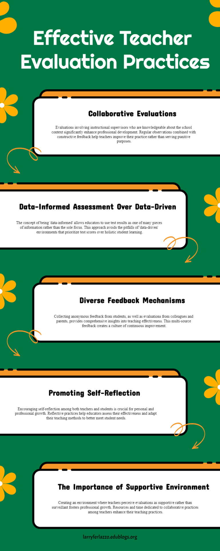
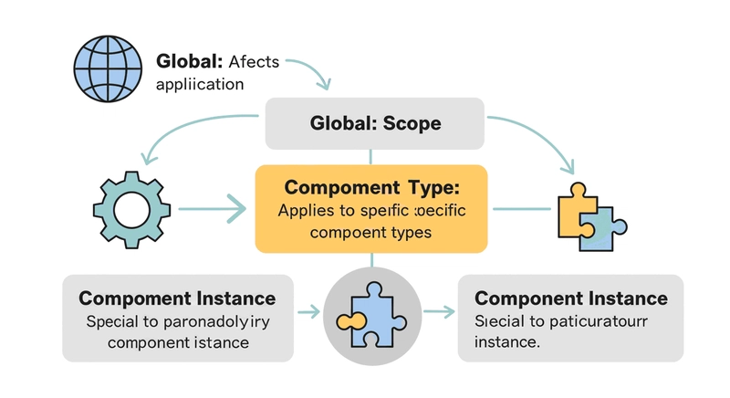
3. Customization Scopes in Vaadin
Vaadin offers three main scopes for style customization:
i. Global: Properties that affect the entire application.
ii. Component Type: Global variables applicable to a specific component type.
iii. Component Instance: Style definitions specific to a particular instance of a component.
4. Example of customization:
i. Instantiation in Java:
Button specialButton = new Button("I'm special");
ii. Naming the instance:
specialButton.addClassName("special");
iii. Customization via CSS:
vaadin-button.special { --lumo-primary-color: cyan; }
5. Conclusion
Vaadin's customization techniques provide a robust framework for enhancing the styling of components.

By understanding and utilizing these techniques, developers can create visually appealing and functional applications that meet their specific design requirements.
Opss. Our conversation is not done yet... See you in the final part of this subject, in our next article about it.
• Disclaimer
This content is drawn from studies and notes related to the Vaadin 24 certification. For deeper details, please consult the official documentation and learning materials for Vaadin certification. AI tools assisted in the structuring of this content; however, the writing and original content are solely done by the author.
Authors
Paulo B. A. is an 'Oracle Certified Java Developer' and 'Spring Certified Professional' with a deep passion for Vaadin Flow. He crafts UIs with Vaadin and strives to make it the leading frontend framework for full-stack Java developers worldwide. He loves teaching, sharing knowledge, and creating content. While he enjoys learning theory through certifications, he always advocates for a practical approach.
• Linkedin.com/in/pbalves
• X.com/p_b_alves
• Mastodon.social/@pbalves
Staff Writer: Fábio A. P. is a technology enthusiast, self-taught writer, and scholar of society's relationship with technology. Passionate about sharing insights, he provides reliable perspectives on how technology shapes our lives. With clear and precise writing, Fábio simplifies complex topics, empowering readers to navigate the digital age with confidence.
• Medium.com/@fabioape