


Split Fiction Effect in Browser
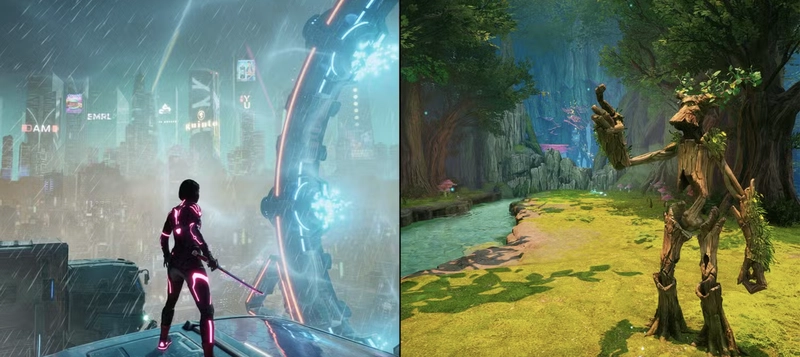
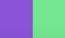
Inspired by the video game Split Fiction, I'm amazed by the creators' imagination in showcasing two distinct worlds side by side through a split screen. Motivated by their creativity, I am eager to recreate this split effect right within the browser. Basic HTML & CSS The easiest part of this effect is to create a static split screen in the browser. The skeleton: Some basic CSS reset: html, body { margin: 0; padding: 0; height: 100%; overflow: hidden; user-select: none; cursor: crosshair; background: #222; } Let the container cover the full screen: .container { position: relative; width: 100vw; height: 100vh; overflow: hidden; } Both sides should cover the entire screen, utilizing clip-path to control which area is displayed on each side. .side { position: absolute; top: 0; left: 0; width: 100%; height: 100%; pointer-events: none; } .left-side { background-color: rgb(150, 72, 222); z-index: 1; clip-path: polygon(0 0, 50% 0, 50% 100%, 0 100%); } .right-side { background-color: rgb(55, 234, 136); z-index: 1; clip-path: polygon(50% 0, 100% 0, 100% 100%, 50% 100%); } You got: Add background image for both sides: .left-side { background-image: url(https://static0.gamerantimages.com/wordpress/wp-content/uploads/2024/12/split-fiction-splitscreen-platforming.jpg?q=49&fit=crop&w=750&h=422&dpr=2); background-size: cover; background-position: center; background-repeat: no-repeat; z-index: 1; clip-path: polygon(0 0, 50% 0, 50% 100%, 0 100%); } .right-side { background-image: url(https://static0.gamerantimages.com/wordpress/wp-content/uploads/2024/12/split-fiction-fantasy-transformations.jpg?q=49&fit=crop&w=750&h=422&dpr=2); background-size: cover; background-position: center; background-repeat: no-repeat; z-index: 1; clip-path: polygon(50% 0, 100% 0, 100% 100%, 50% 100%); } You got background image on both sides: Rotate the Split Line with JavaScript Our target is to update the clip-path along with mouse moving. Here's the brain-teaser time!
Inspired by the video game Split Fiction, I'm amazed by the creators' imagination in showcasing two distinct worlds side by side through a split screen. Motivated by their creativity, I am eager to recreate this split effect right within the browser.
Basic HTML & CSS
The easiest part of this effect is to create a static split screen in the browser.
The skeleton:
 class="container" id="container">
   class="side left-side" id="leftSide">