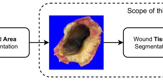


I code 10x faster using TailwindCSS
Hey guys, it's your boy LuckyReact. If you’re a developer who loves speed and efficiency, Tailwind CSS is like that overpowered cheat code that makes your UI development super fast. Instead of writing tons of custom CSS, you just use utility classes to style elements directly in your HTML or JSX. Let’s break down how Tailwind CSS boosts productivity like a pro. 1. No More Context Switching In traditional CSS, you have to: Write HTML Switch to a CSS file Define a class Apply styles Go back and forth for adjustments With Tailwind, everything stays in one place. No switching between files, just add classes directly: Click Me One-liner styling = Less mental overhead 2. No Need to Name Classes Creatively We’ve all struggled with class names like: container-main-wrapper hero-section-header-text big-blue-button With Tailwind, forget the naming headache! Just describe styles using utility classes: Hello, Tailwind! No more "What should I name this class?" moments! 3. Faster Prototyping = Faster Development Tailwind is perfect for rapid prototyping because you don’t need to write custom styles. Want a card UI? Just throw in some classes: Tailwind is Awesome! Building UIs has never been this fast. From idea to UI in minutes! 4. Built-in Responsive Design Instead of writing @media queries manually, Tailwind makes responsiveness a breeze: Responsive Padding sm: → Small screens md: → Medium screens lg: → Large screens One-liner responsiveness = No need for separate CSS files! 5. Consistent Design Without Extra Effort Tailwind comes with a pre-configured design system, so you don’t have to worry about inconsistent margins, paddings, or font sizes. The spacing system follows a scale (4, 8, 12, 16, etc.), making layouts cleaner. Item 1 Item 2 Item 3 Automatically maintains proper spacing! 6. Dark Mode? Just One Class Away! Instead of writing complex CSS for dark mode, Tailwind makes it super easy: Dark Mode Ready! Enable dark mode by just adding dark: classes! 7. No More CSS Bloat Tailwind uses Just-in-Time (JIT) compilation, which means it only includes the styles you use in your final CSS file. Unlike Bootstrap or other frameworks, you don’t end up with unused CSS. Smaller CSS = Faster load times! 8. Perfect for Teams and Scaling Since Tailwind follows a utility-first approach, every developer on the team understands styling immediately. No need to learn someone else’s custom CSS structure—just use common utility classes. Consistent styling = Easier collaboration! I hope enjoyed reading the article. If you think my content is useful, please consider reacting to this post and add a positive comment as well. See ya in the next article. Have a great day ahead!
Hey guys, it's your boy LuckyReact. If you’re a developer who loves speed and efficiency, Tailwind CSS is like that overpowered cheat code that makes your UI development super fast. Instead of writing tons of custom CSS, you just use utility classes to style elements directly in your HTML or JSX.
Let’s break down how Tailwind CSS boosts productivity like a pro.
1. No More Context Switching
In traditional CSS, you have to:
- Write HTML
- Switch to a CSS file
- Define a class
- Apply styles
- Go back and forth for adjustments
With Tailwind, everything stays in one place. No switching between files, just add classes directly:
<button className="bg-blue-500 text-white px-4 py-2 rounded-lg">
  Click Me
button>
One-liner styling = Less mental overhead
2. No Need to Name Classes Creatively
We’ve all struggled with class names like:
-
container-main-wrapper -
hero-section-header-text -
big-blue-button
With Tailwind, forget the naming headache! Just describe styles using utility classes:
<h1 className="text-4xl font-bold text-gray-800">Hello, Tailwind!h1>
No more "What should I name this class?" moments!
3. Faster Prototyping = Faster Development
Tailwind is perfect for rapid prototyping because you don’t need to write custom styles. Want a card UI? Just throw in some classes:
<div className="max-w-sm bg-white shadow-lg rounded-lg p-4">
  <h2 className="text-xl font-semibold">Tailwind is Awesome!h2>
  <p className="text-gray-600">Building UIs has never been this fast.p>
div>
From idea to UI in minutes!
4. Built-in Responsive Design
Instead of writing @media queries manually, Tailwind makes responsiveness a breeze:
<div className="p-4 sm:p-6 md:p-8 lg:p-12">
  Responsive Padding
div>
-
sm:→ Small screens -
md:→ Medium screens -
lg:→ Large screens
One-liner responsiveness = No need for separate CSS files!
5. Consistent Design Without Extra Effort
Tailwind comes with a pre-configured design system, so you don’t have to worry about inconsistent margins, paddings, or font sizes. The spacing system follows a scale (4, 8, 12, 16, etc.), making layouts cleaner.
<div className="space-y-4">
  <p className="text-lg">Item 1p>
  <p className="text-lg">Item 2p>
  <p className="text-lg">Item 3p>
div>
Automatically maintains proper spacing!
6. Dark Mode? Just One Class Away!
Instead of writing complex CSS for dark mode, Tailwind makes it super easy:
<div className="bg-white dark:bg-gray-900 text-black dark:text-white p-4">
  Dark Mode Ready!
div>
Enable dark mode by just adding dark: classes!
7. No More CSS Bloat
Tailwind uses Just-in-Time (JIT) compilation, which means it only includes the styles you use in your final CSS file. Unlike Bootstrap or other frameworks, you don’t end up with unused CSS.
Smaller CSS = Faster load times!
8. Perfect for Teams and Scaling
Since Tailwind follows a utility-first approach, every developer on the team understands styling immediately. No need to learn someone else’s custom CSS structure—just use common utility classes.
Consistent styling = Easier collaboration!
I hope enjoyed reading the article. If you think my content is useful, please consider reacting to this post and add a positive comment as well. See ya in the next article. Have a great day ahead!