


How to Build a Star Wars Language Translator in React
I created a Star Wars language translator React component, so YOU don't have to! This article includes a quick start guide, integration details, and links to the repo and deployed Aurebesh project! Aurebesh Translator App (TL;DR Summary and Integration Guide) May the Force, and May the 4th, be with you! Feel free to clone or fork the project to explore how it works! You can use it as a foundation to start your own project, allowing you to experiment with the code, modify it to suit your needs, and learn more about the Aurebesh translation app's functionality. Enjoy the process of learning and making the project your own! Here are the links to the project: GitHub repo Netlify deployed project Quick Start Guide For those who already have a project and wish to integrate the Aurebesh translation component, this guide provides a straightforward method. By following the outlined steps, you can seamlessly incorporate the component into your existing setup, enhancing your project with Star Wars-inspired functionality. Each file plays a crucial role in providing the functionality and styling needed to translate English text into Aurebesh and display it with customizable options. Below is a brief overview of each file and its purpose within the app, ensuring you have all the components and utilities required to get started seamlessly. App.jsx: The main application component that integrates all other components and manages the overall state of the app, including dark mode and text orientation. AurebeshTranslatorComponent.jsx: A component responsible for translating English text into Aurebesh and displaying it with customizable styles. Navbar.jsx: A component that provides a navigation bar with toggle buttons to switch between dark mode, Aurebesh translation, and vertical text layout. These are examples; you can implement your own methods for creating and passing props. ToggleButton.jsx: A reusable button component that toggles between active and inactive states, used within the Navbar. Feel free to customize the implementation to suit your needs. aurebeshTranslator.jsx: A utility module that contains the logic for mapping English characters to Aurebesh and rendering them with appropriate styles. useDarkMode.js: A custom React hook that manages the dark mode state, allowing the app to toggle between light and dark themes. AurebeshTranslatorComponent.module.css: A CSS module that defines styles for the Aurebesh characters and layout, ensuring proper display and spacing (to prevent style conflicts and enable scoped styling). App.css: A global CSS file that sets the base styles for the app, including body styles, button margins, and theme-specific styles for dark and light modes. Aurebesh Translator Component: By following the steps below, you can seamlessly integrate the Aurebesh translation app into your project and customize it to suit your needs. To integrate the Aurebesh translation app into your project, follow these steps to ensure a smooth setup: Create a New React Project: If you haven't already, create a new React project (Check out my article for detailed steps: Create a React Project, Push It to GitHub, and Deploy With Netlify, From the Command Line). Copy the Files: Copy each of the provided files into your project directory, maintaining the suggested folder structure. For example, place AurebeshTranslatorComponent.jsx and its corresponding CSS module in a components/AurebeshTranslatorComponent folder. Install Dependencies: Ensure you have all necessary dependencies installed. If your project uses additional libraries (e.g., for CSS modules), install them using npm or yarn. For example, run npm install or yarn install to ensure all dependencies are up to date. Import Components and Utilities: In your App.jsx file, import the components and utilities as shown in the code snippets. This includes importing useDarkMode, AurebeshTranslatorComponent, Navbar, and any CSS files. Run the Project: Start your development server by running npm start or yarn start. This will launch your app in the browser, allowing you to see the Aurebesh translation functionality in action. Introduction As an avid Star Wars fan, I was always intrigued by the Aurebesh language. Exactly what is the Aurebesh language? Fortunately, it is just English; a symbol represents each letter of the alphabet. For more information, please refer to the Wikipedia page.

I created a Star Wars language translator React component, so YOU don't have to! This article includes a quick start guide, integration details, and links to the repo and deployed Aurebesh project!
Aurebesh Translator App (TL;DR Summary and Integration Guide)
May the Force, and May the 4th, be with you! Feel free to clone or fork the project to explore how it works! You can use it as a foundation to start your own project, allowing you to experiment with the code, modify it to suit your needs, and learn more about the Aurebesh translation app's functionality. Enjoy the process of learning and making the project your own!
Here are the links to the project:

Quick Start Guide
For those who already have a project and wish to integrate the Aurebesh translation component, this guide provides a straightforward method. By following the outlined steps, you can seamlessly incorporate the component into your existing setup, enhancing your project with Star Wars-inspired functionality.
Each file plays a crucial role in providing the functionality and styling needed to translate English text into Aurebesh and display it with customizable options. Below is a brief overview of each file and its purpose within the app, ensuring you have all the components and utilities required to get started seamlessly.
App.jsx: The main application component that integrates all other components and manages the overall state of the app, including dark mode and text orientation.
AurebeshTranslatorComponent.jsx: A component responsible for translating English text into Aurebesh and displaying it with customizable styles.
Navbar.jsx: A component that provides a navigation bar with toggle buttons to switch between dark mode, Aurebesh translation, and vertical text layout. These are examples; you can implement your own methods for creating and passing props.
ToggleButton.jsx: A reusable button component that toggles between active and inactive states, used within the Navbar. Feel free to customize the implementation to suit your needs.
aurebeshTranslator.jsx: A utility module that contains the logic for mapping English characters to Aurebesh and rendering them with appropriate styles.
useDarkMode.js: A custom React hook that manages the dark mode state, allowing the app to toggle between light and dark themes.
AurebeshTranslatorComponent.module.css: A CSS module that defines styles for the Aurebesh characters and layout, ensuring proper display and spacing (to prevent style conflicts and enable scoped styling).
App.css: A global CSS file that sets the base styles for the app, including body styles, button margins, and theme-specific styles for dark and light modes.
Aurebesh Translator Component:
      <AurebeshTranslatorComponent
        data={`may the 4th be with you!`} // Text to be translated
        isAurebesh={isAurebesh} // Toggle for Aurebesh translation
        scale={.5} // Scale of the text
        isWhite={isDarkMode} // Text color based on dark mode
        isVertical={isVertical} // Text orientation
        verticalLetterSpacing="-7px" // Letter spacing for vertical text
        horizontalLetterSpacing="10px" // Letter spacing for horizontal text
        fontSize={"16px"} // Font size of the text
      />
By following the steps below, you can seamlessly integrate the Aurebesh translation app into your project and customize it to suit your needs.
To integrate the Aurebesh translation app into your project, follow these steps to ensure a smooth setup:
Create a New React Project: If you haven't already, create a new React project (Check out my article for detailed steps: Create a React Project, Push It to GitHub, and Deploy With Netlify, From the Command Line).
Copy the Files: Copy each of the provided files into your project directory, maintaining the suggested folder structure. For example, place AurebeshTranslatorComponent.jsx and its corresponding CSS module in a components/AurebeshTranslatorComponent folder.
Install Dependencies: Ensure you have all necessary dependencies installed. If your project uses additional libraries (e.g., for CSS modules), install them using npm or yarn. For example, run npm install or yarn install to ensure all dependencies are up to date.
Import Components and Utilities: In your App.jsx file, import the components and utilities as shown in the code snippets. This includes importing useDarkMode, AurebeshTranslatorComponent, Navbar, and any CSS files.
Run the Project: Start your development server by running npm start or yarn start. This will launch your app in the browser, allowing you to see the Aurebesh translation functionality in action.
Introduction
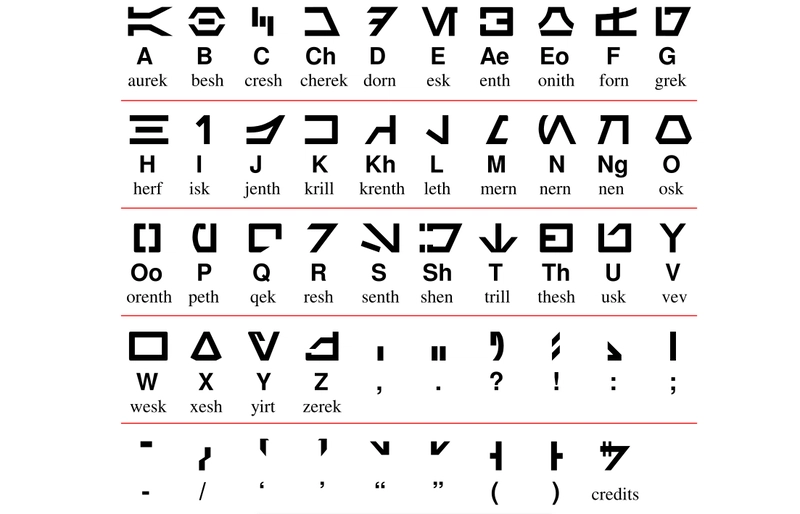
As an avid Star Wars fan, I was always intrigued by the Aurebesh language. Exactly what is the Aurebesh language? Fortunately, it is just English; a symbol represents each letter of the alphabet. For more information, please refer to the Wikipedia page.